Where can you find affordable 3D renderings? .Search Magpies Design 3D. www.magpiesdesign3d.com
Showing posts with label Architectural design. Show all posts
Showing posts with label Architectural design. Show all posts
December 13, 2018
Groupe 3 Architectes wraps the airport of Guelmim in a skin of perforated multicolored panels
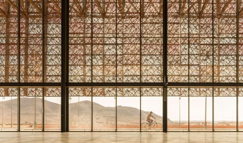
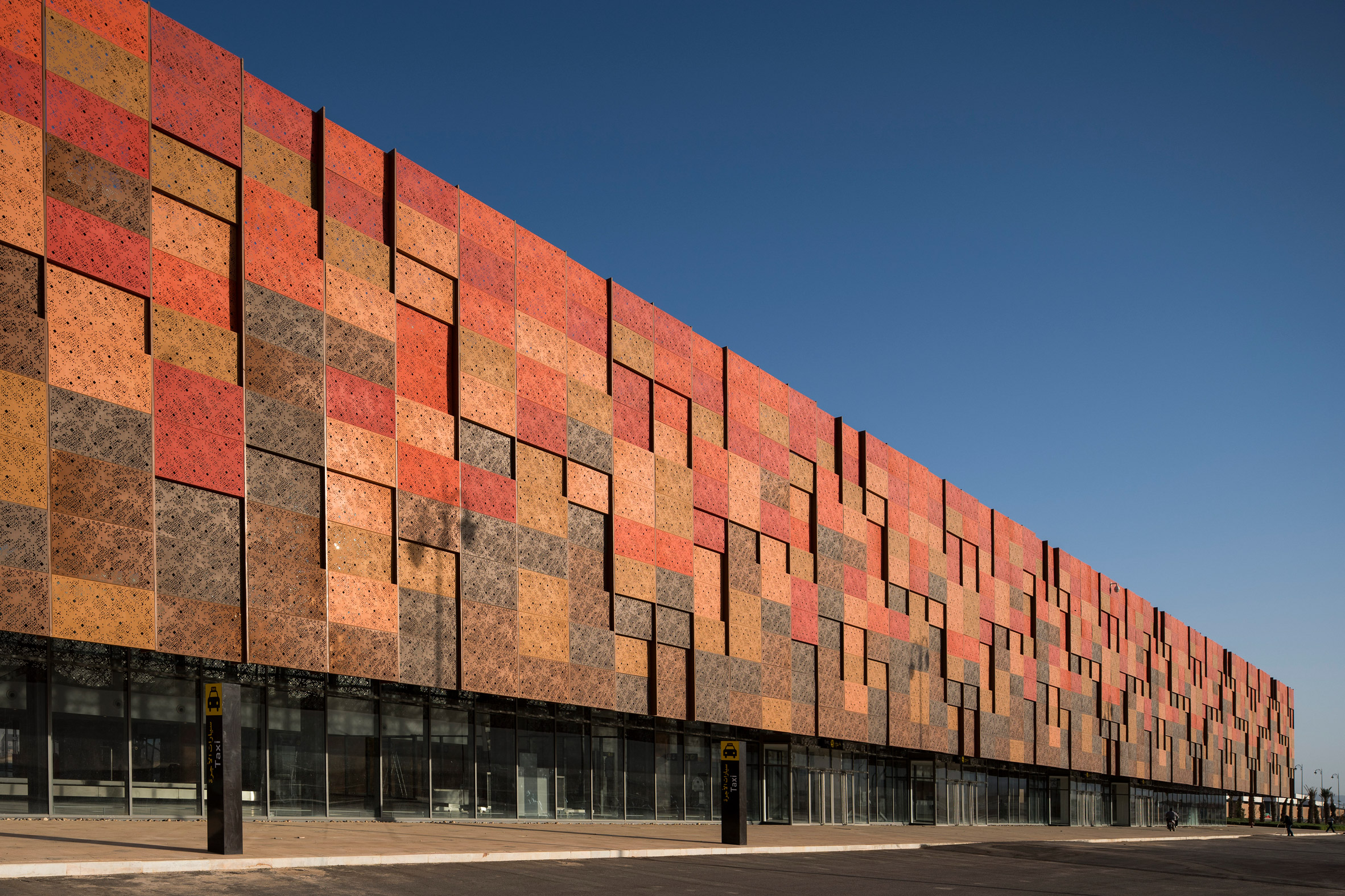
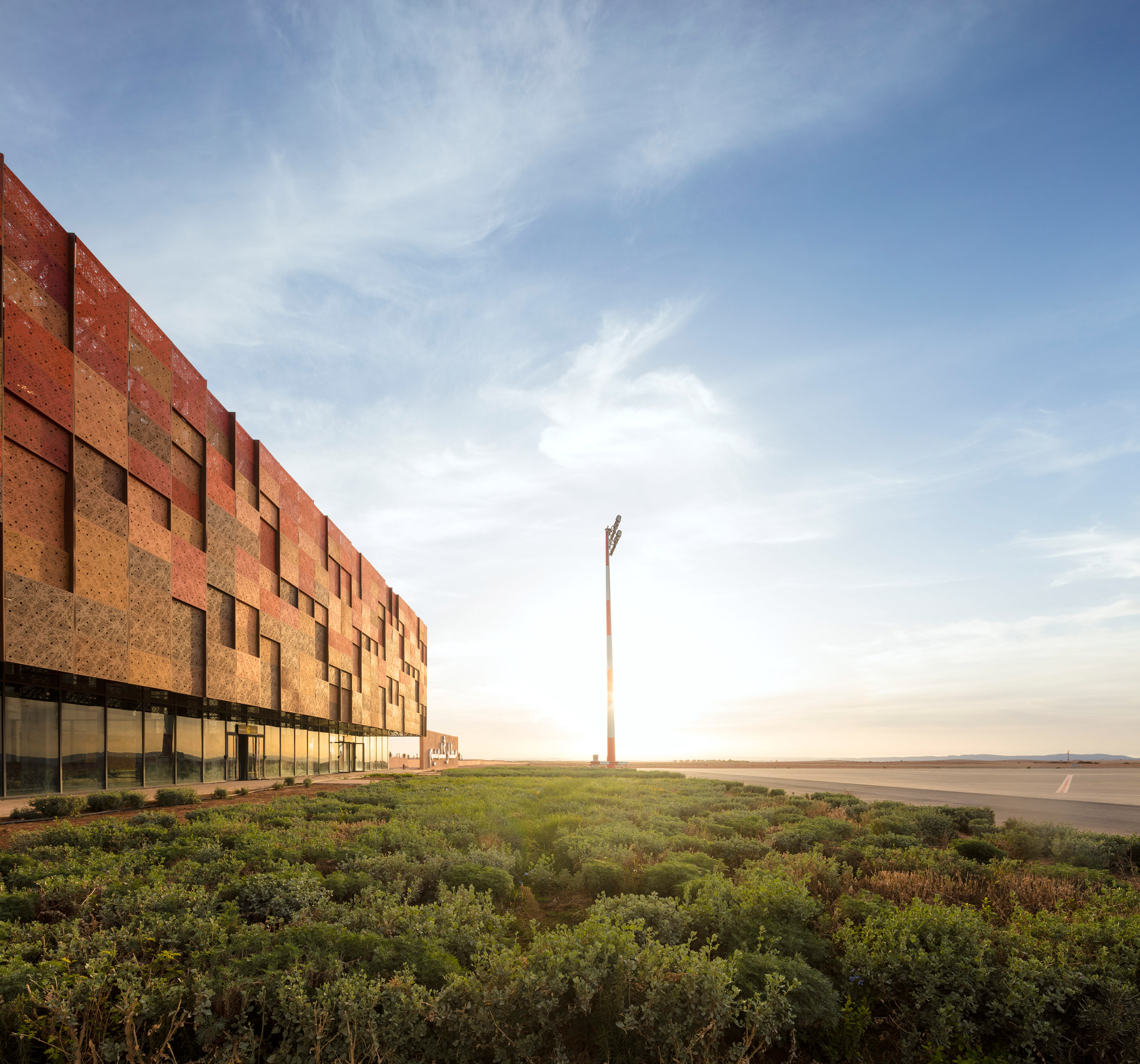
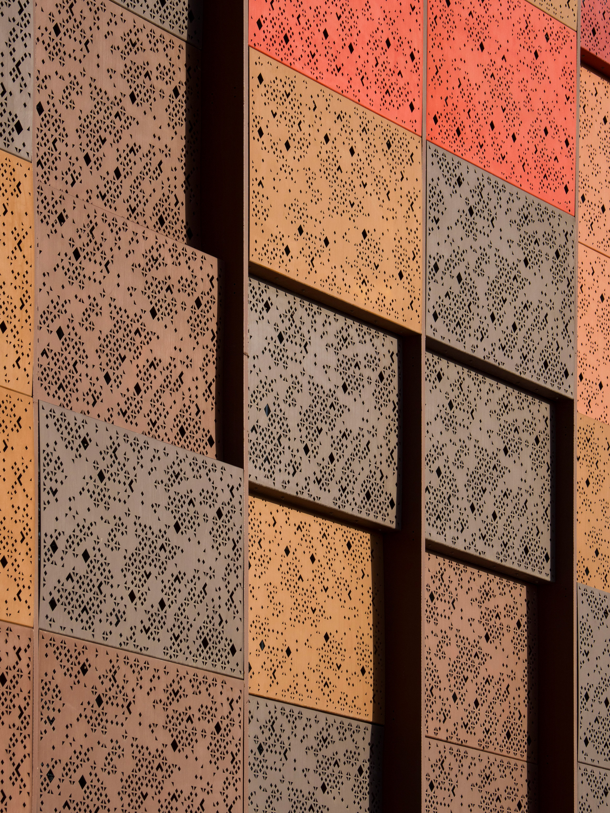
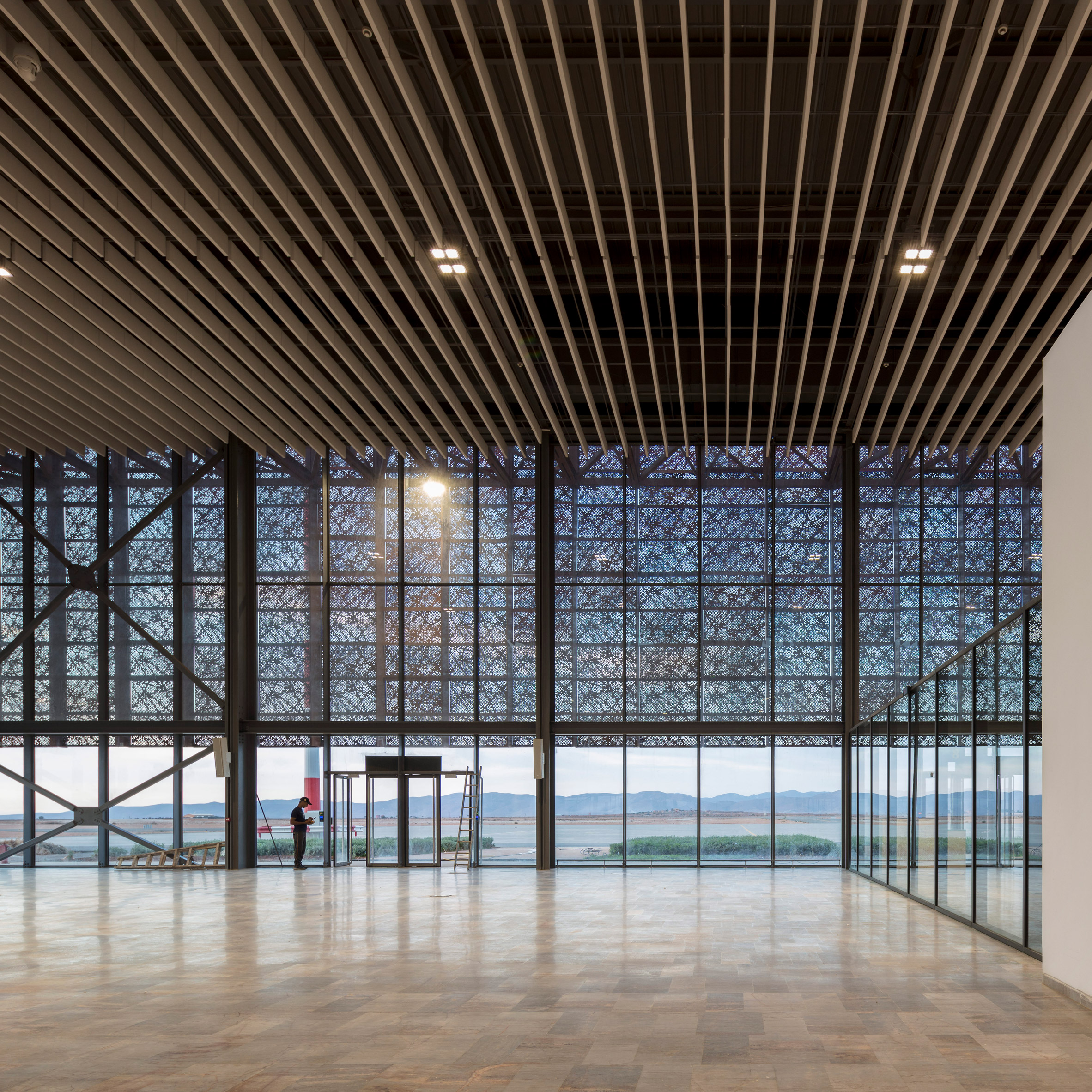
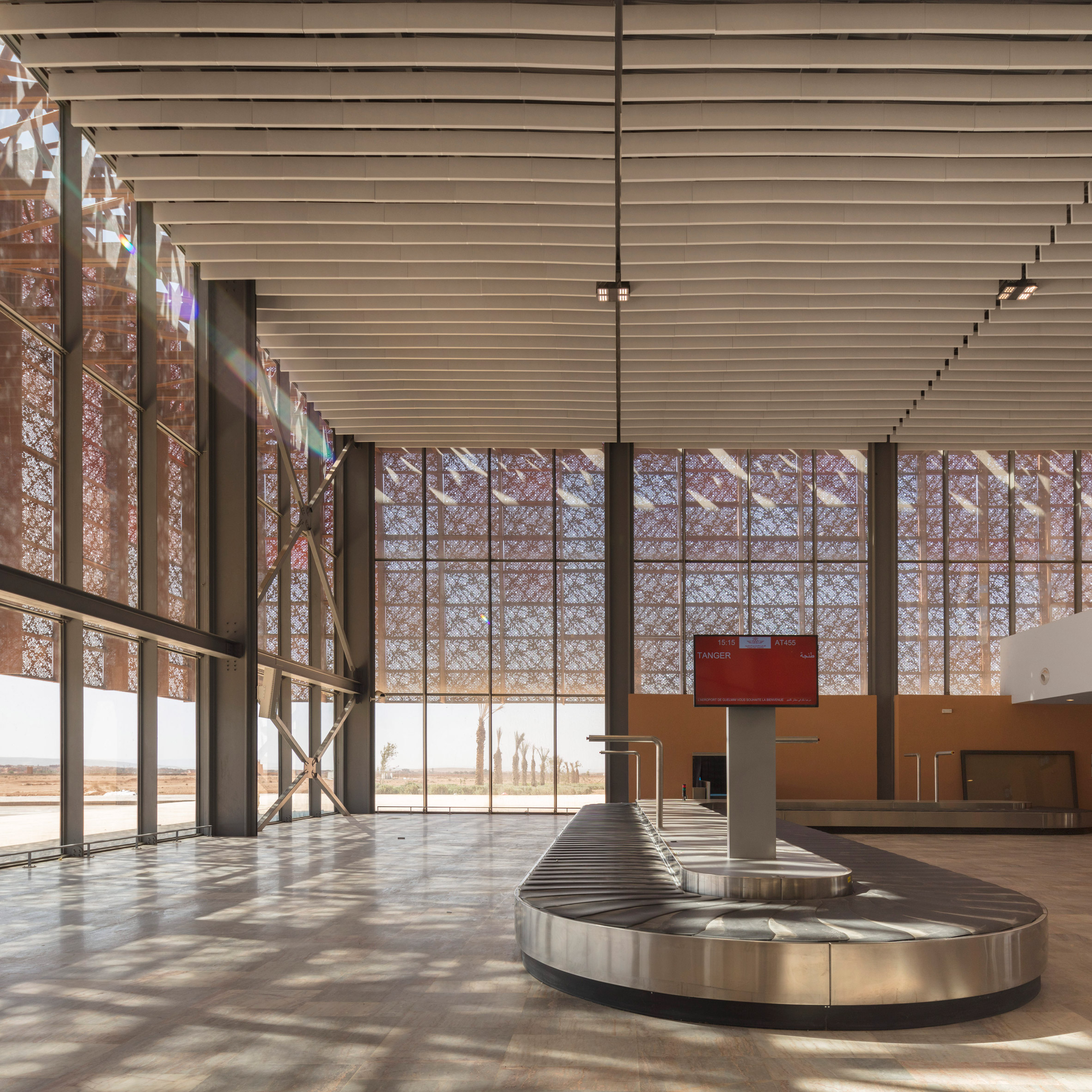
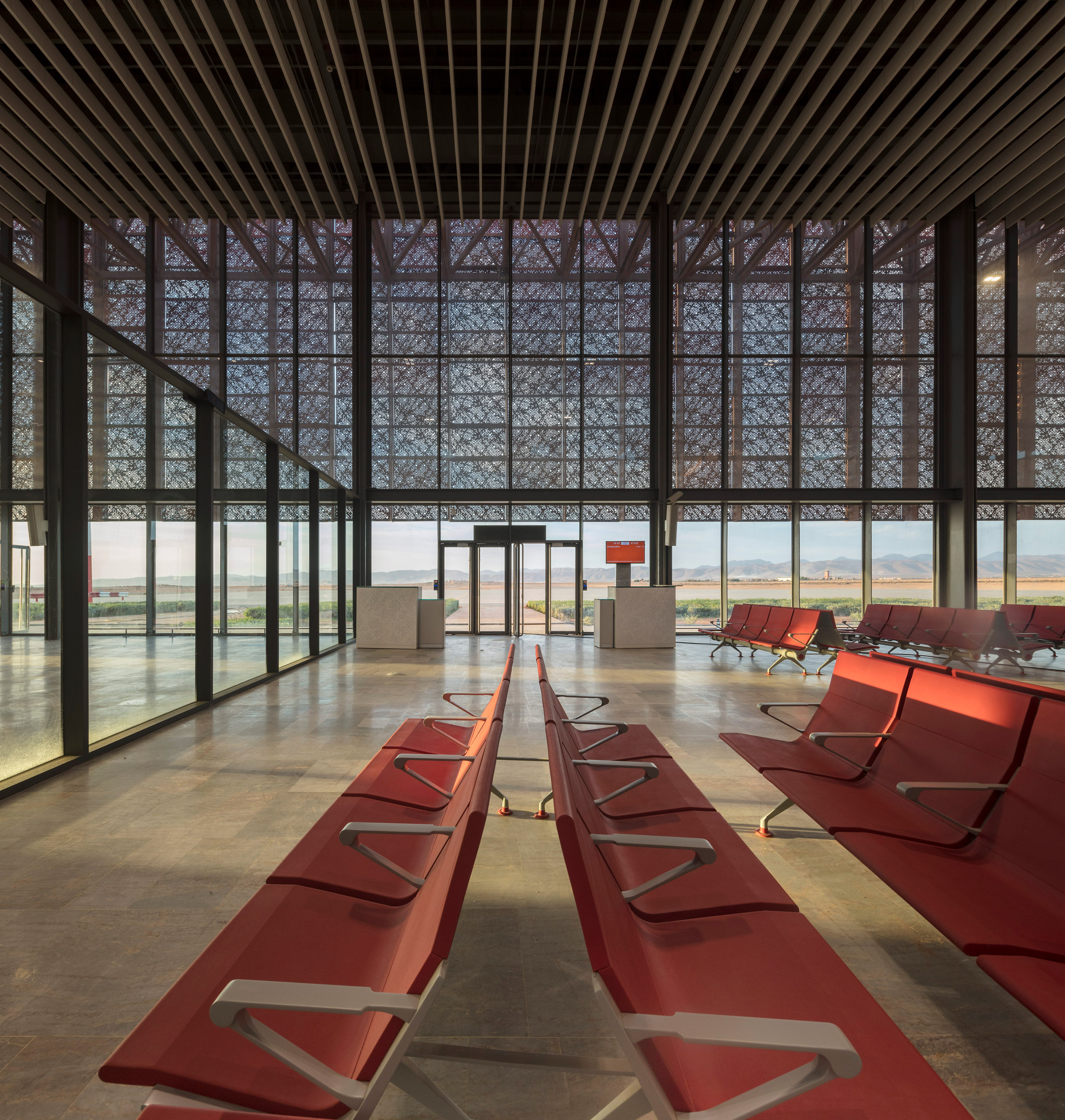
Groupe 3 Architectes has completed an airport for the city of Guelmim, in Morocco, with a light filtering facade formed by multicolored metal mesh panels.
The airport, designed by the architecture office based in Rabat, is located on the site of an existing military base about three kilometers north of Guelmim, in southwestern Morocco.
The city is often known as the gateway to the desert, due to its position in the southern mountains of the Anti-Atlas, near the northwest edge of the Sahara.
The key criteria for airport design were simplicity, efficiency, environmental control and longevity, which was achieved through the development of a proposal that can be expanded if necessary.
"The main problem of the project was to provide the maximum amount of natural light and ventilation to avoid expensive technical equipment," the architects explained, "while optimizing the view of the surrounding landscape, which facilitates the movement and flow of building users" .
The airport is arranged on a line that runs parallel to the runways and was built in two phases.
The terminal was completed first and then joined by a couple of lower structures at each end that house a free trade zone and a duty-free zone.
The terminal building consists of two double-height rooms that contain the check-in, departure, customs and baggage claim areas.
The public areas of the airport look through large windows towards the landscape on one side and the tracks on the other.
The expansive glazed surfaces are protected from the desert sun by a screen made of colored metal panels that are suspended around the perimeter of the building.
The metallic surfaces are finished in a range of complementary colors to create a mosaic effect that aims to recall the traditional decorative styles of the region.
The panels are displaced along the facades, which helps to break the visual mass of the structure by introducing a dynamic pattern of light and shadow.
A section of the roof that extended along the spine of the terminal was removed to create a large patio with tension-proof umbrellas, which allows daylight to flow into the central areas of the building.
The photograph is by Fernando Guerra.
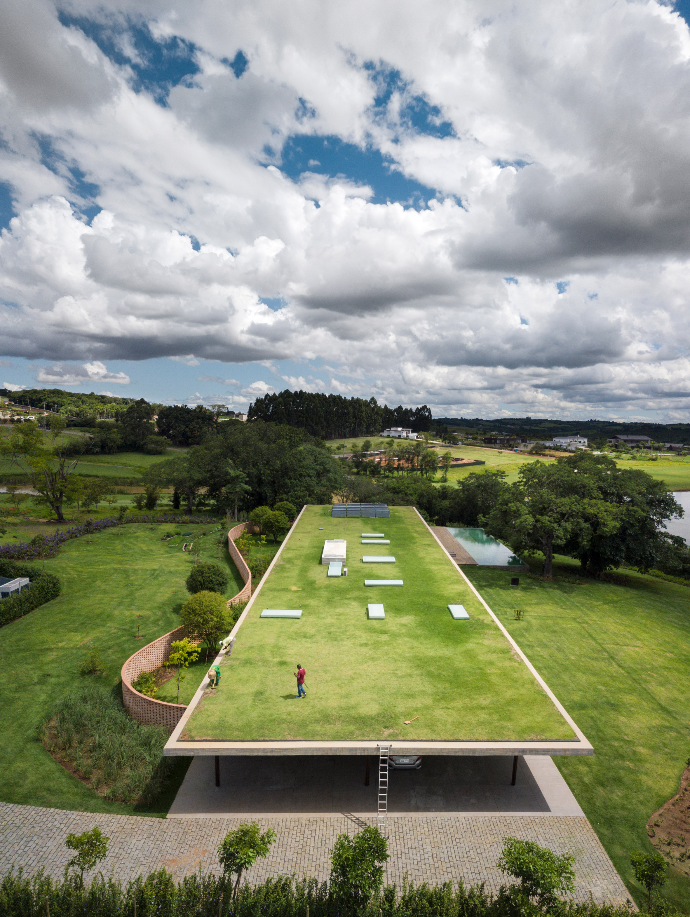
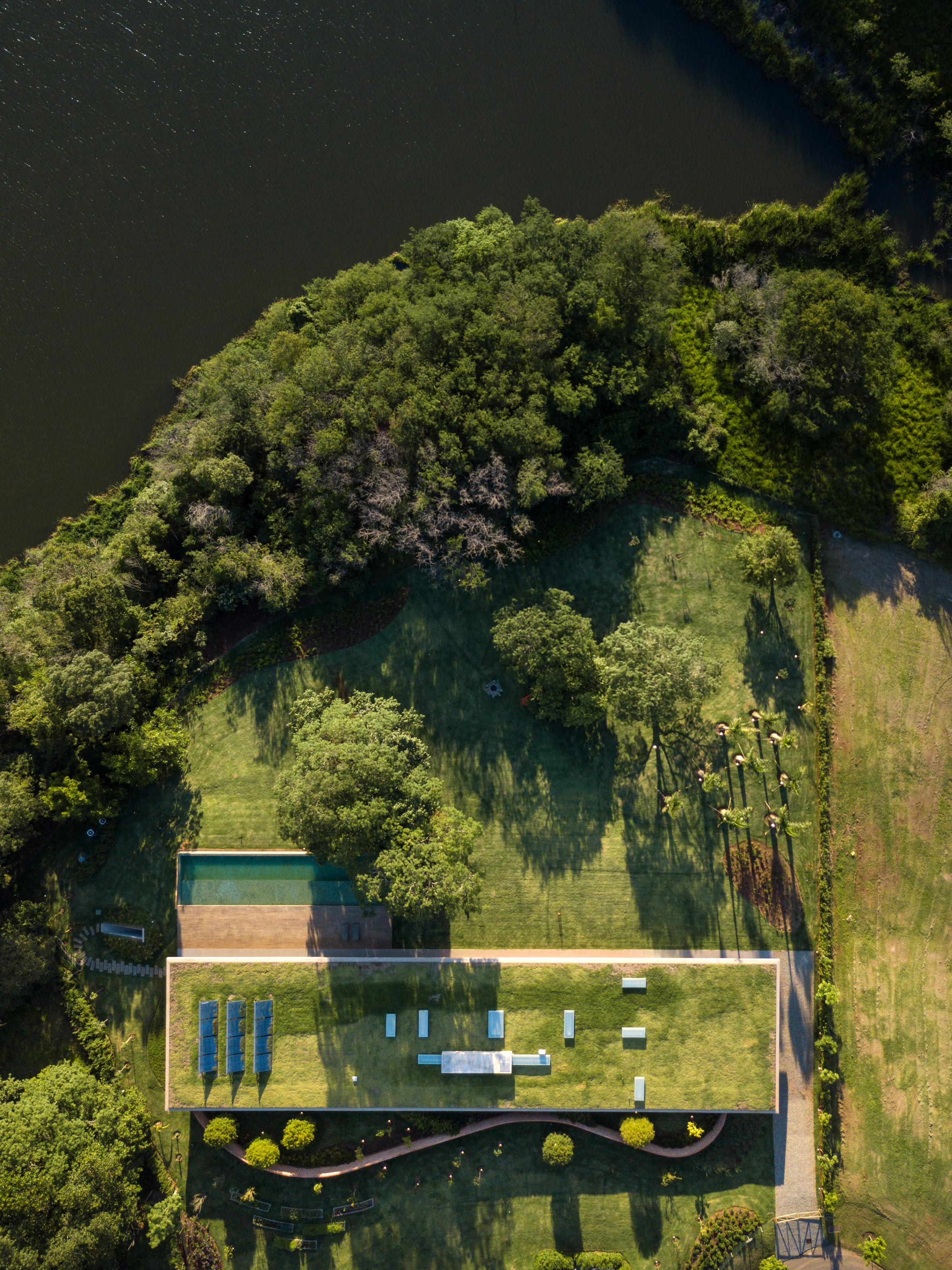
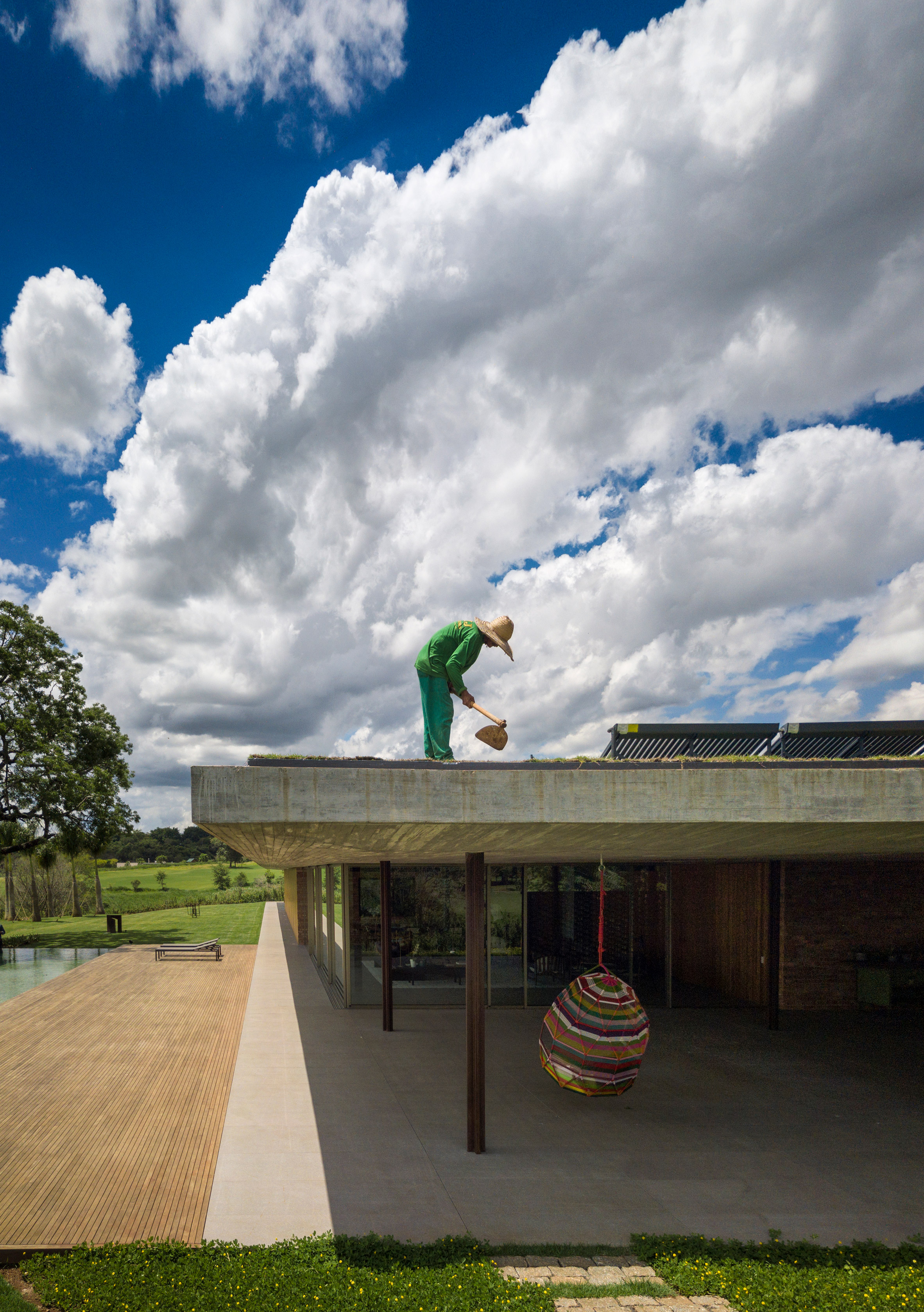
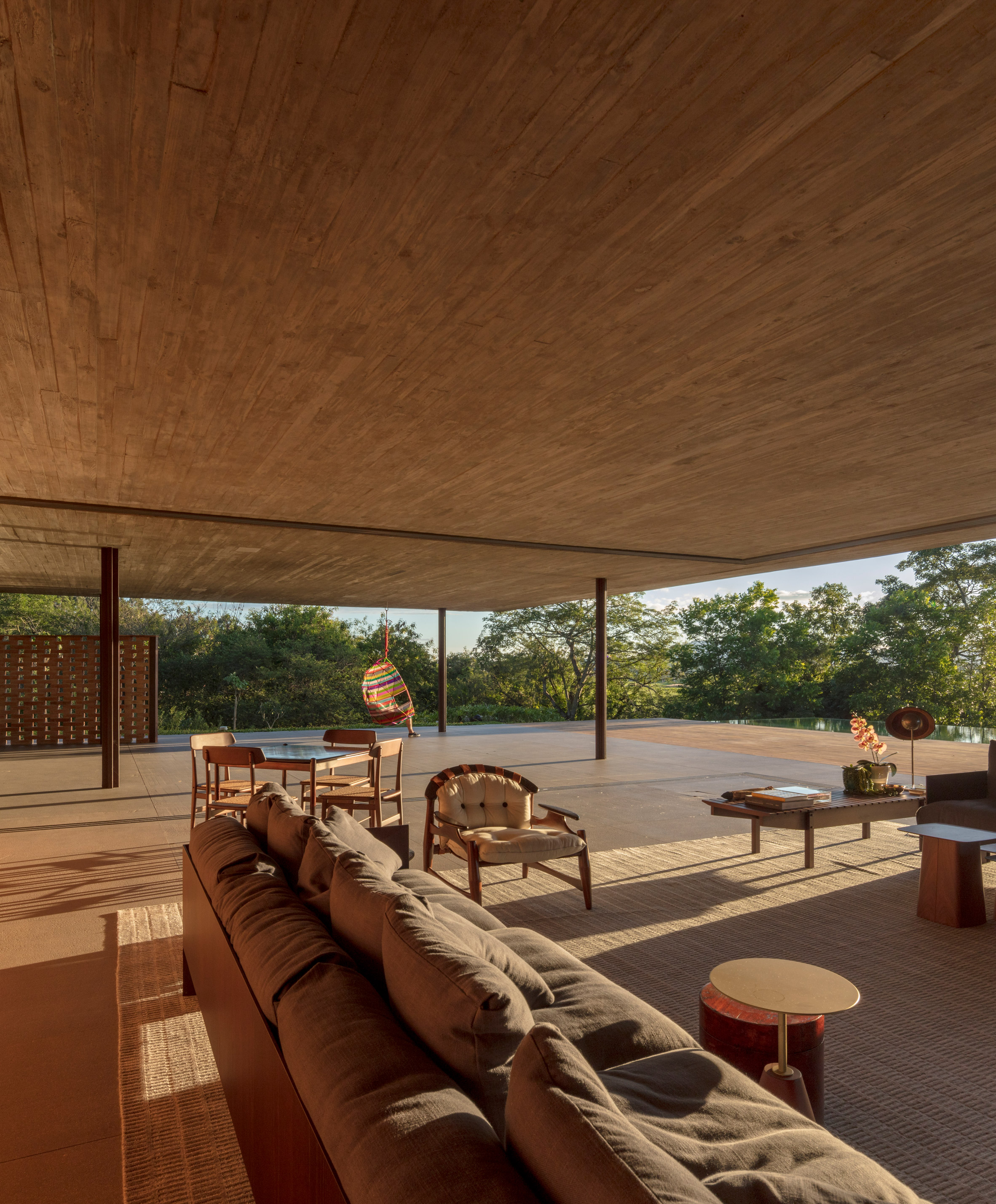
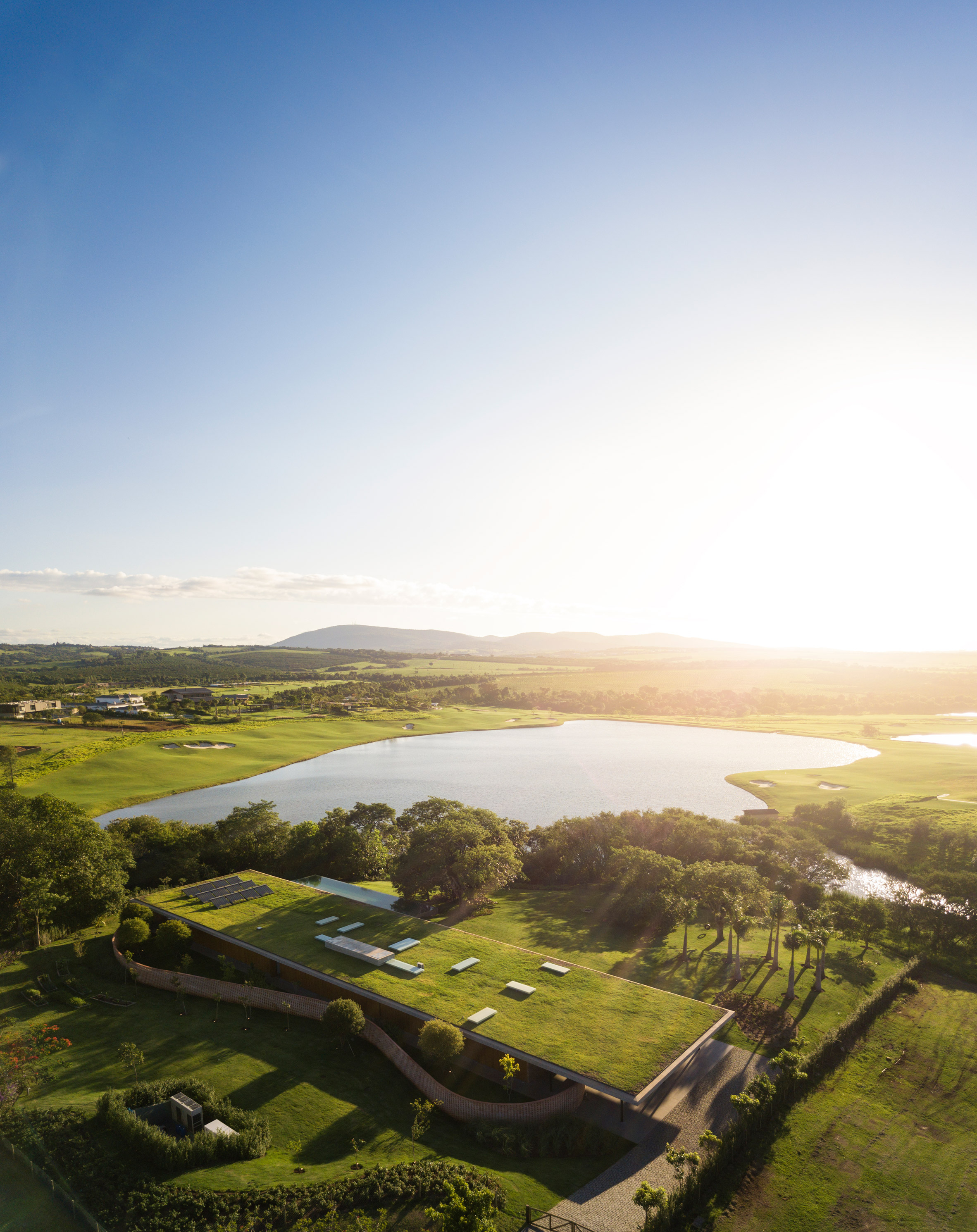
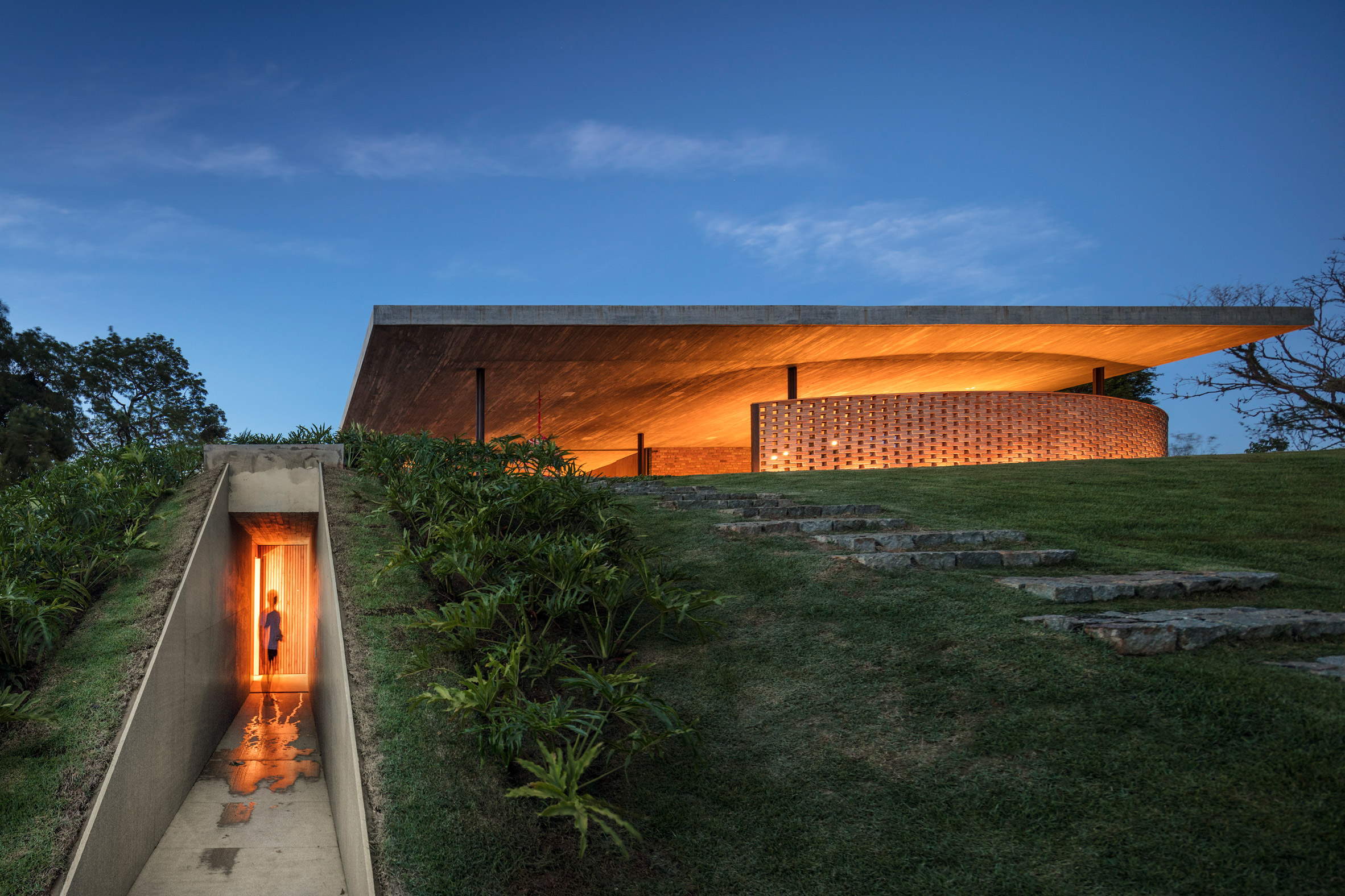
Monumental grass roof covers Planar House in Brazil by Studio MK27
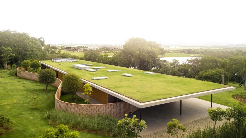
This minimalist residence on the outskirts of São Paulo by Studio MK27 offers residents a variety of enclosed and open spaces beneath an imposing, grassy concrete roof.
Completed in February 2018, the longitudinal residence is called Casa Planar because of the expansive surface that defines the roof.
"Planar House is a radical exercise in horizontality, an aspect commonly explored in the projects of the study," said the local study MK27 in a description of the project.
In some areas, the thick slab rests directly on a grid of cruciform columns, while in others it rests on supporting walls. However, there are no support beams visible throughout the house.
"This type of insertion in the plot required care and attention with the design of the roof, which is the fifth facade of the building", said the architects.
Aerial photographs of the project show vegetation, skylights and solar panels that cover the roof.
The main entrance to the house from the north, on the narrow side of the long rectangular plane. An opening in a curve, made of separate bricks, leads to an entrance garden.
Inside, two volumes make up the programmed spaces of the 1,000 square meter residence. Both are oriented from north to south and run parallel to each other.
The first contains service spaces, such as a children's playroom, the kitchen and a gym at home. The other consists of five one-bedroom suites, arranged in a single row facing the sloping landscape.
"The living rooms are located at the extremities and can be opened or closed completely with sliding glass doors, transforming the whole house into a terrace," said Studio MK27.
A brick wall, which is sometimes concave and sometimes convex, snakes through the building and contrasts with the orthogonal design.
"Around the rigid formal distribution, there is a vertical winding wall made of bricks arranged in solid and empty," the study said. "Paradoxically, it defines the different relationships between internal and external spaces."
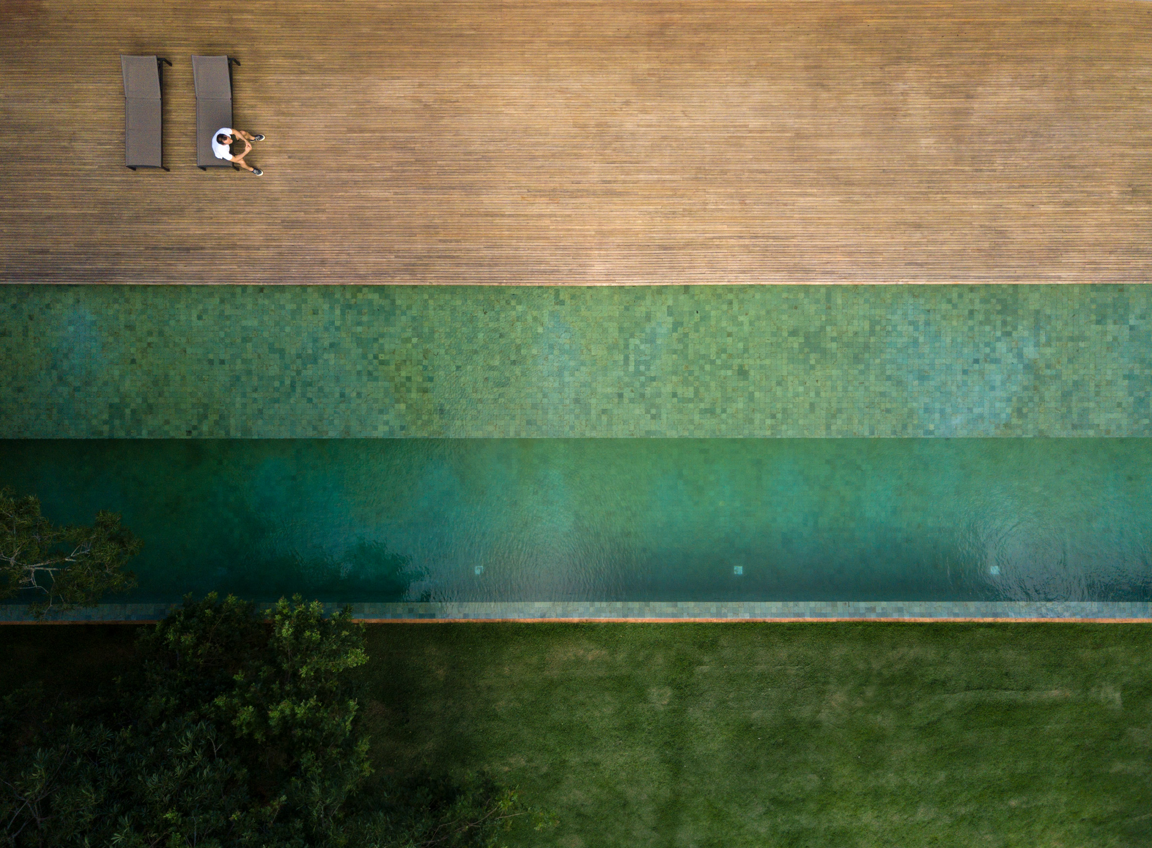
At the southern end of the residence, a few steps lead from the living room to a swimming pool. The interiors have a limited palette of materials that includes wood and concrete.
The firm, led by Brazilian architect Marcio Kogan, has completed a multitude of projects around the world. They include an exuberant property in Miami with its own lagoon and a residence in Brasilia that is inspired by the modernist heritage of the city.
The photograph is by Fernando Guerra.
V & A presents a large section of the Robin Hood Gardens at the Venice Architecture Biennale
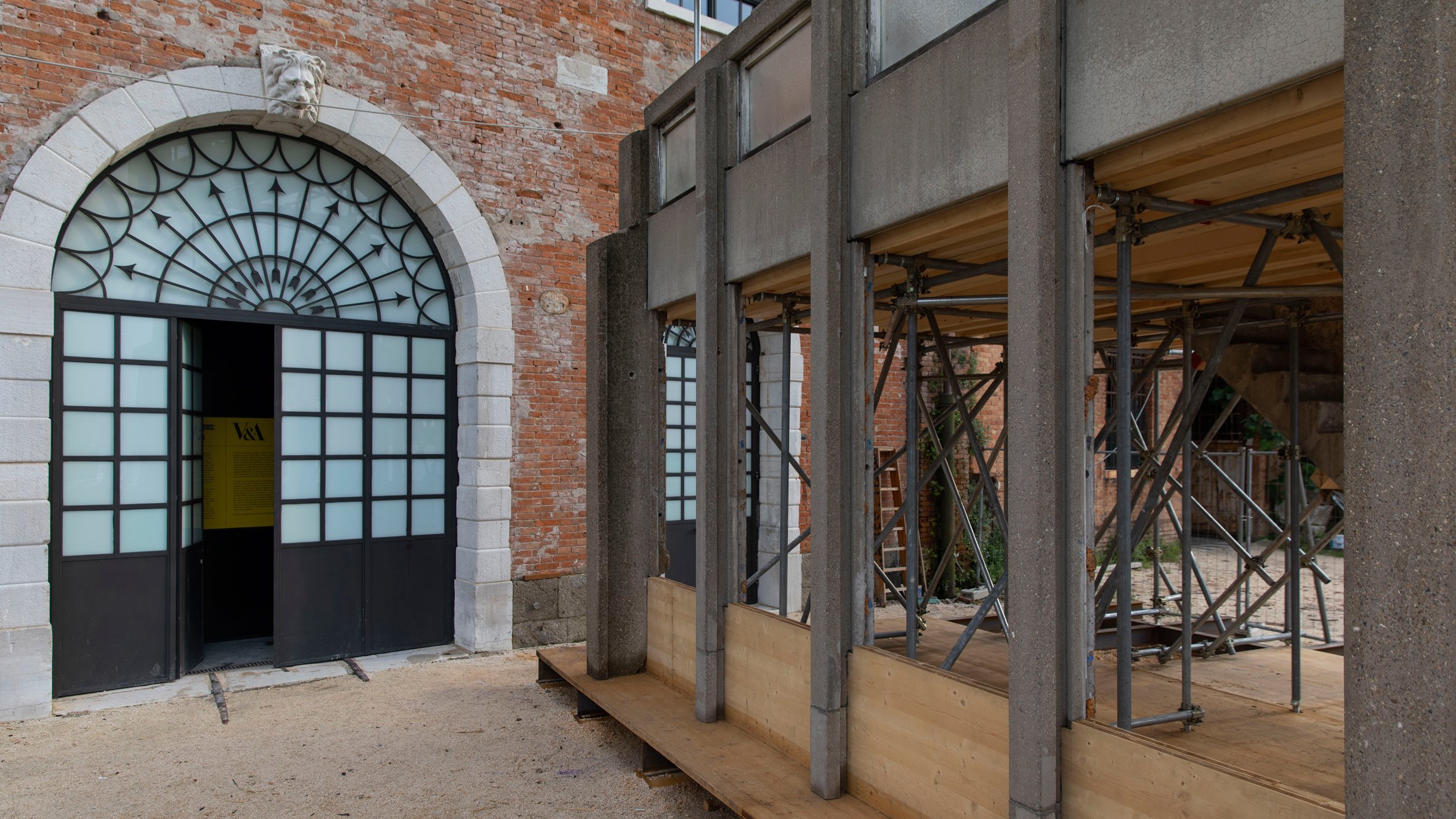
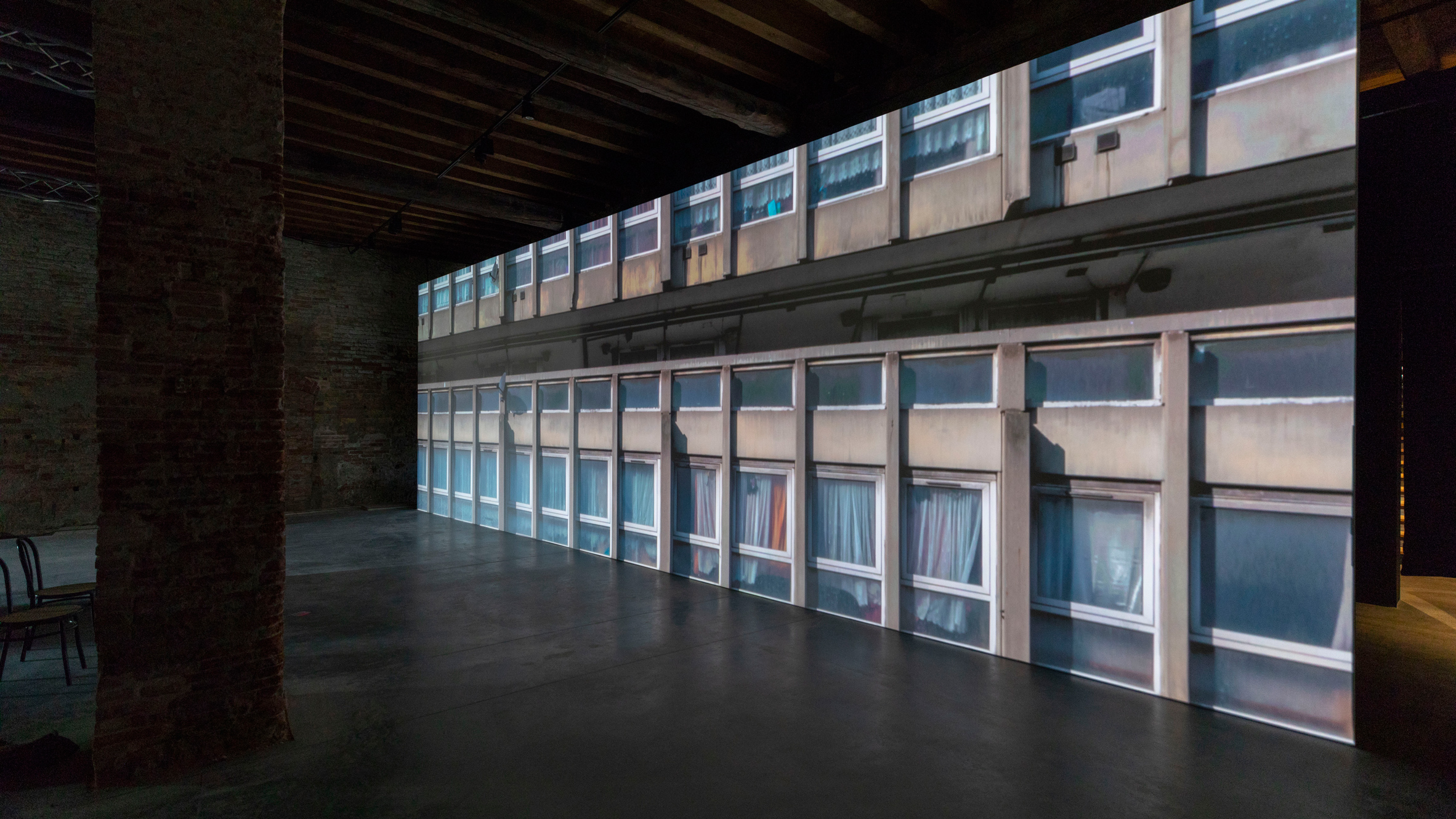
Visitors to the Venice Architecture Biennale can walk the "streets in the sky" of London's Robin Hood Gardens, as the V & A Museum has sent a large part of the Brutalist urbanization to Italy.
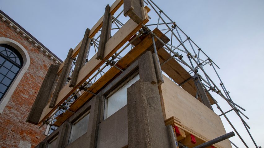
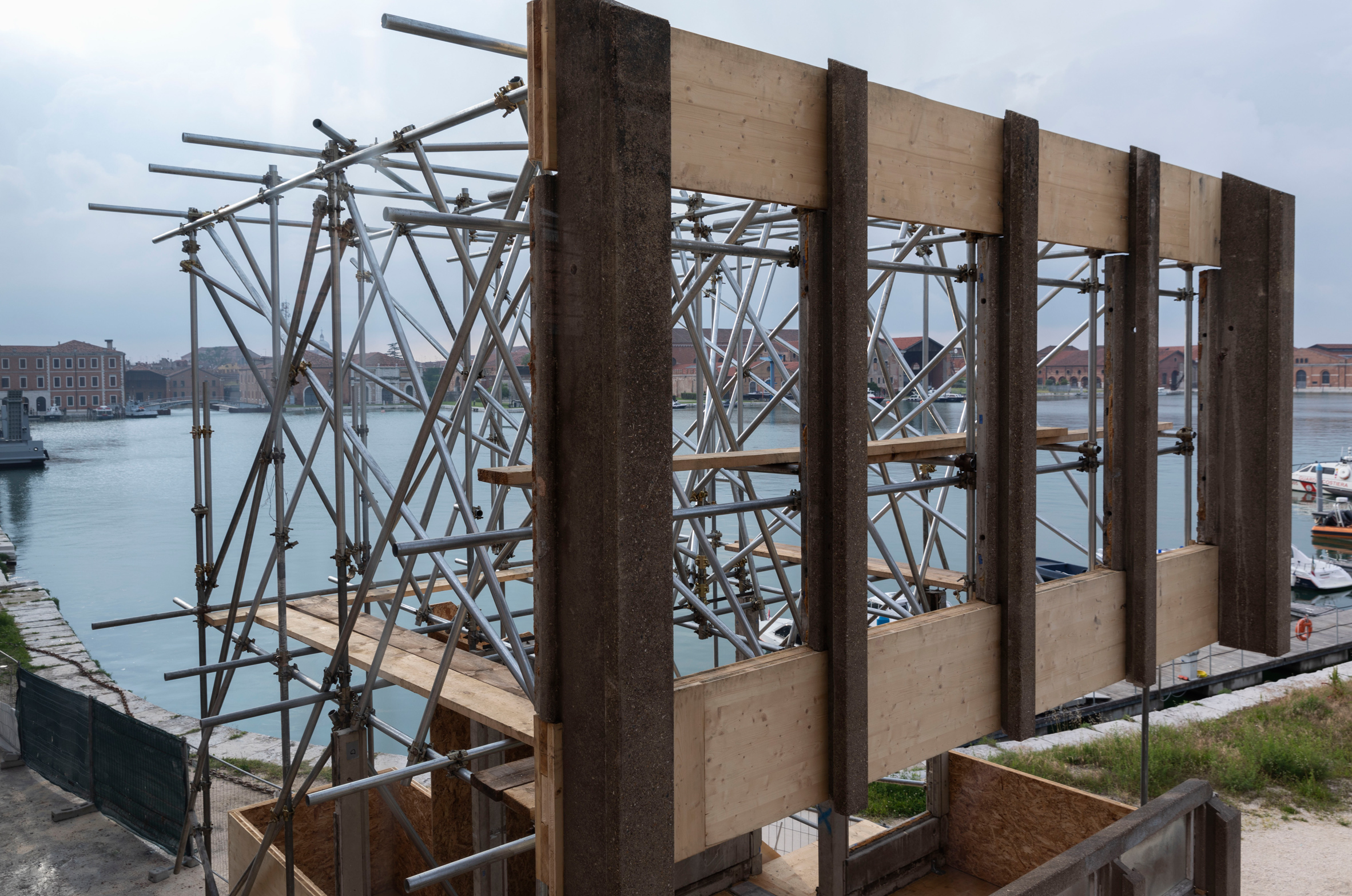
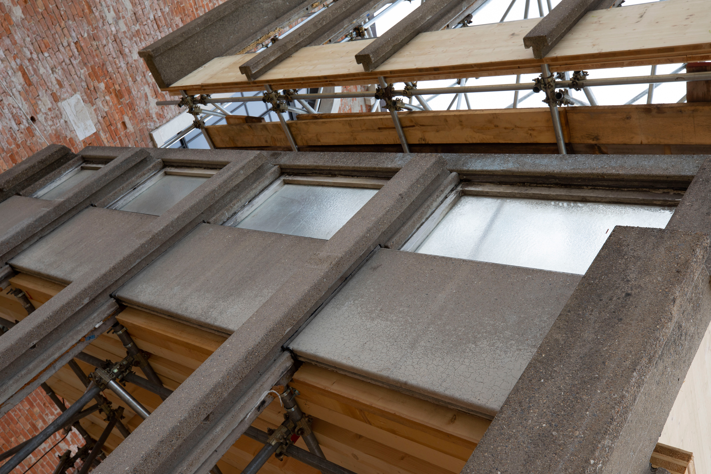
As a key piece of the Robin Hood Gardens exhibition: A Ruin in Reverse, the fragment is the facade of an apartment of the famous Brutalist estate, which was built by the architects Alison and Peter Smithson in 1974, but which is now halfway of the demolition.
The various elements of the structure are held in place by a complex system of scaffolding, designed by the Arup engineers. This makes it possible for visitors to the biennial to climb one of the elevated corridors that were a key feature of the design.
The V & A shows part of the demolished Robin Hood gardens at the Venice Architecture Biennale
The V & A announced that it was acquiring part of Robin Hood Gardens shortly before the demolition began in December 2017. In addition to this section, which was specifically extracted for exhibition in Venice, the museum also took all the components to reassemble a bedroom full. flat.
It has not been announced when this larger fragment will be revealed to the public. But it will contain the modular furniture installed when the building was first opened, as well as the concrete structure and façade.
The pieces of the concrete facade are mounted on a scaffolding system devised by the Arup engineers, shown here while it is still under construction.
Robin Hood Gardens consisted of two blocks of concrete blocks, arranged on opposite sides of a large garden. The broad walkways, described as streets in the sky by the Smithsons, were intended to encourage the street life of London's traditional townhouses.
It is being demolished for a new housing development by the Swan Housing Association, despite a long campaign for the building to be listed as heritage, supported by many famous architects.
The installation allows visitors to the biennial to climb the famous "streets in the sky" of the building
This exhibition, located in the Arsenale area of the biennial, aims to explore the legacy of the estate and question whether or not it offers a model for the social housing of the future.
"The Robin Hood Gardens case is an arrest because it represented such a bold vision for the provision of housing, but less than 50 years after its completion it is being demolished," curators Olivia Horsfall Turner and Christopher Turner explained.
"Outside the ruins of Robin Hood Gardens, we want to see again the original ideals of the Smithsons and ask how they can inform and inspire current thinking about social housing."
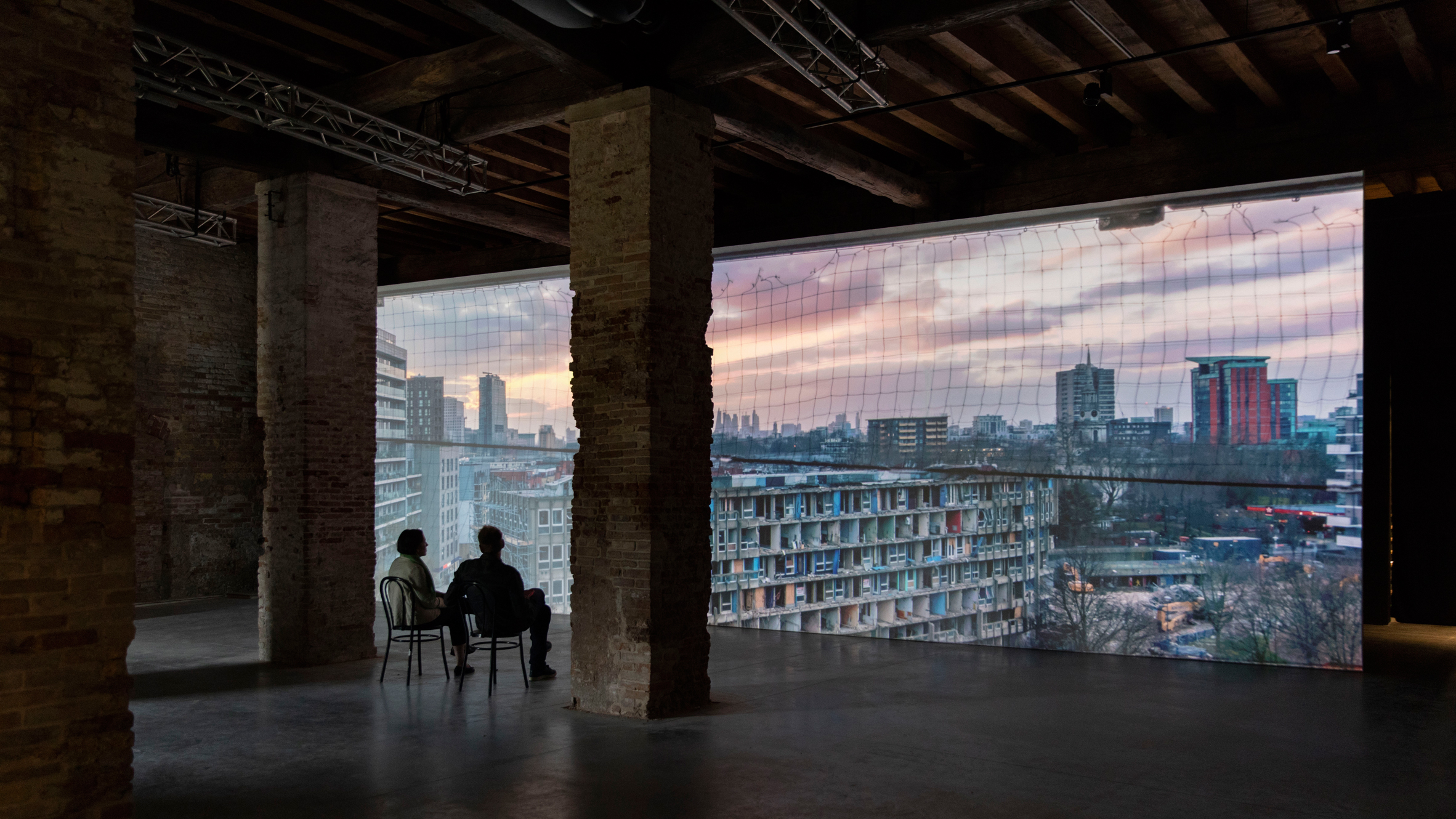
The curators were careful not to "fetishize" the concrete structure and wanted to focus on how the building supported the lives of its residents. So the exhibition also includes a series of photographs and films, which offer a look at the building at different stages of its history.
The exhibition also includes a series of photographs and films that offer a look at the building at different stages of its history.
A film shows four apartments occupied by long-term residents, made by the Korean artist Do Ho Suh, who is known for his intricate recreations of interior spaces with wire and cloth.
Another is the 1970 BBC documentary, The Smithsons on Housing, which explores the social thinking behind design.
"We have tried to map the entire arc of the Smithsons' vision, the twists and turns of farm history and their destiny, and evaluate that as a whole," Turner told Dezeen.
"This was the golden age of the welfare state, this is when the architects of Great Britain had more power to create extraordinary buildings on a large scale," he continued. "Properties like Robin Hood Gardens, Alexandra Road [by Neave Brown] are amazing architectural achievements."
A film by the Korean artist Do Ho Suh offers a look inside four apartments occupied by long-term residents
In the context of the current housing crisis in London, both due to the shortage of affordable housing and the abandonment of properties owned by the city, such as Grenfell Tower, the exhibition seeks to explore what lessons can be learned from the farm.
"We were really interested in the generous architectural and social vision of the Smithsons and in unpacking that and using it as a lens to look forward to the future of social housing," said Turner.
The V & A Museum is located in the London Borough of Kensington and Chelsea, not far from the Grenfell Tower. Only 10 municipal housing units have been built in the municipality since former British Prime Minister Margaret Thatcher granted council tenants the right to buy in the 1980s, Turner said.
"How can we see what prevents us from being able to create affordable housing for everyone in our society? That's the big question," he said. "Increasing the value of land means that it is changing, we are asking what kind of city we want to build now, what kind of provision we want to create for housing in the city that is available to all."
"One of the big differences between when the Smithsons were building and now is that the boards had internal architecture teams and that's why they were constantly working on projects that were for the boards," Turner said. "Almost 80 percent of the architects worked for the council and now it's less than one percent."
Robin Hood Gardens: A Ruin in Reverse is on display until November 25, 2018, as part of the 16th Venice Architecture Biennial
This is not the first time that Robin Hood Gardens is exhibited in Venice: the Smithsons exhibited an image of it during the Venice Art Biennial of 1976.
Writing about the farm at that time, they said: "A building under construction is a ruin in reverse." This was the inspiration for the title of the exhibition.
Robin Hood Gardens: A Ruin in Reverse is on display until November 25, 2018, as part of the 16th Venice Architecture Biennial.
This year, the main exhibition is curated by Yvonne Farrell and Shelley McNamara of Grafton Architects under the title Freespace.
In an interview with Dezeen, Farrell and McNamara said that while architects do not have the power to fight global problems, small projects can make a great contribution to society.
Turner told Dezeen that the generous innovations the Smithsons offered to the residents of Robin Hood Gardens summarize this idea of generosity.
December 12, 2018
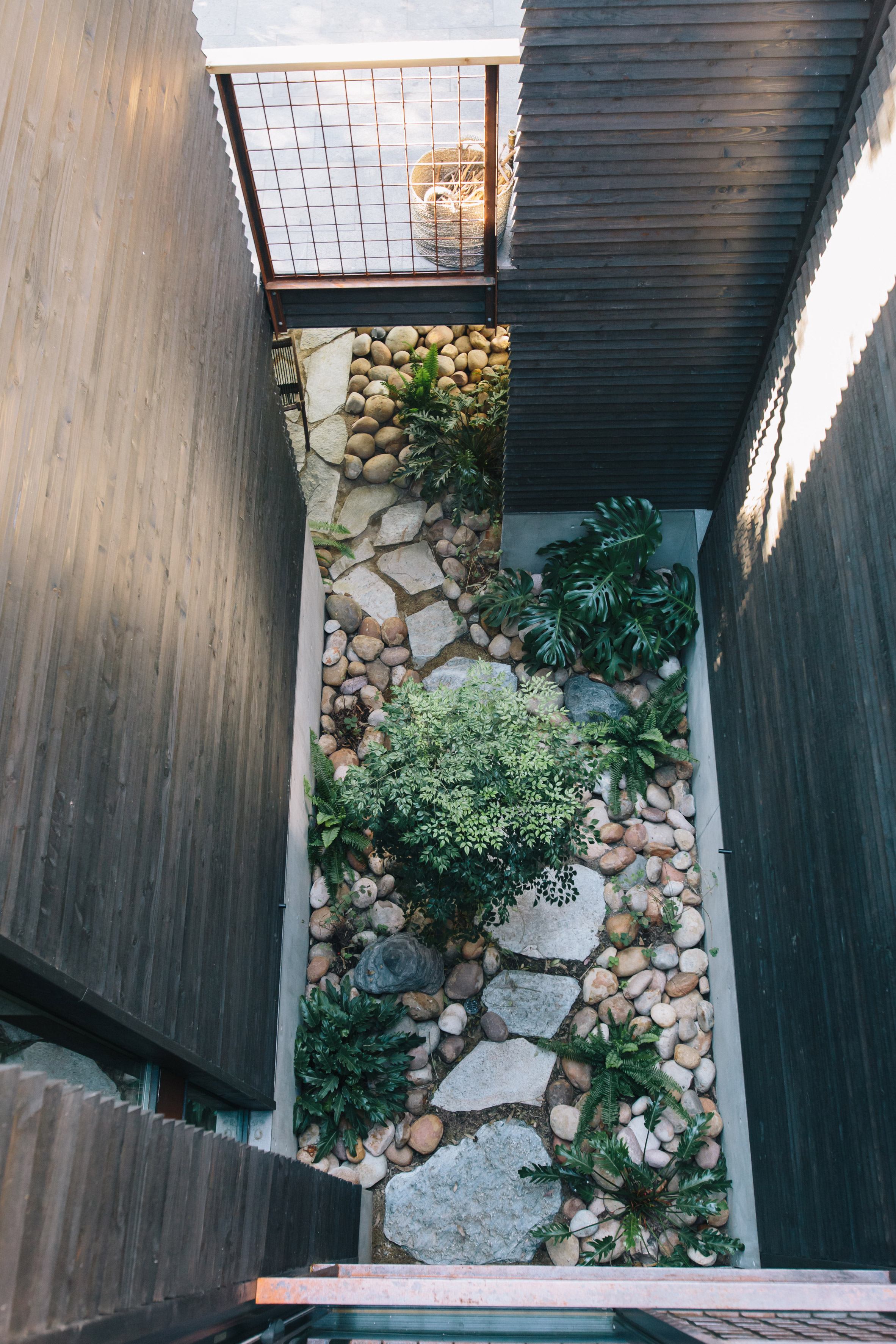
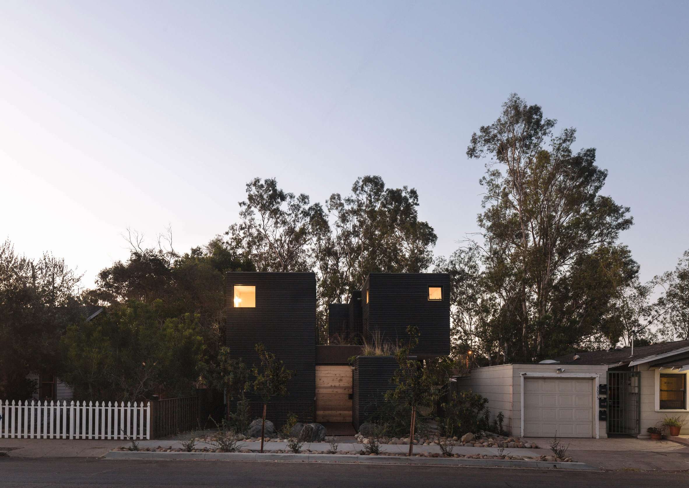
Jeff Svitak builds Redwood House blackened with private studio for himself in Southern California
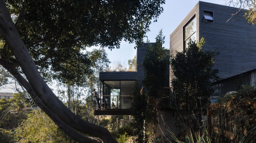
The American architect Jeff Svitak has designed a house located on a hillside in San Diego, with several outdoor spaces and an office for his practice.
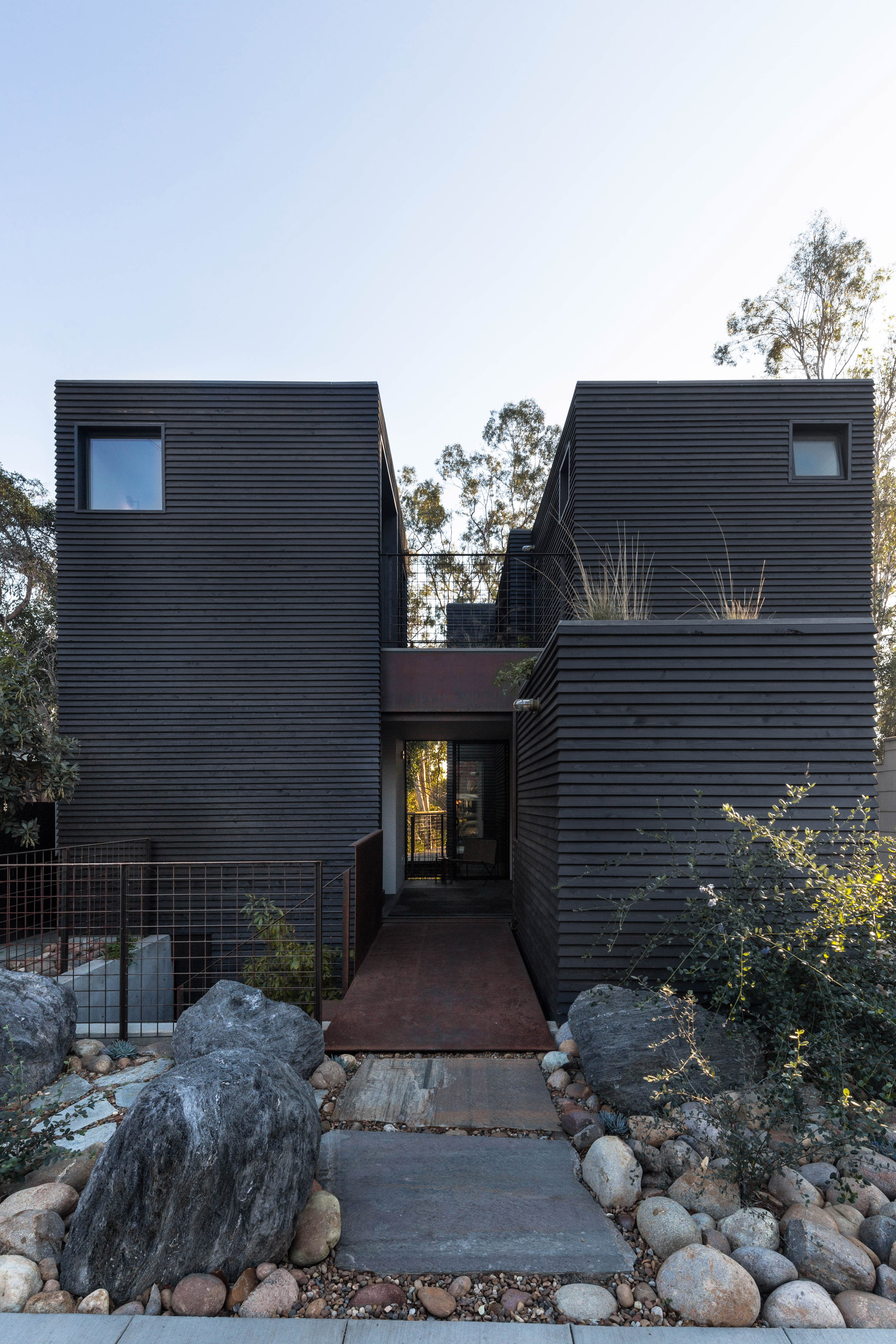
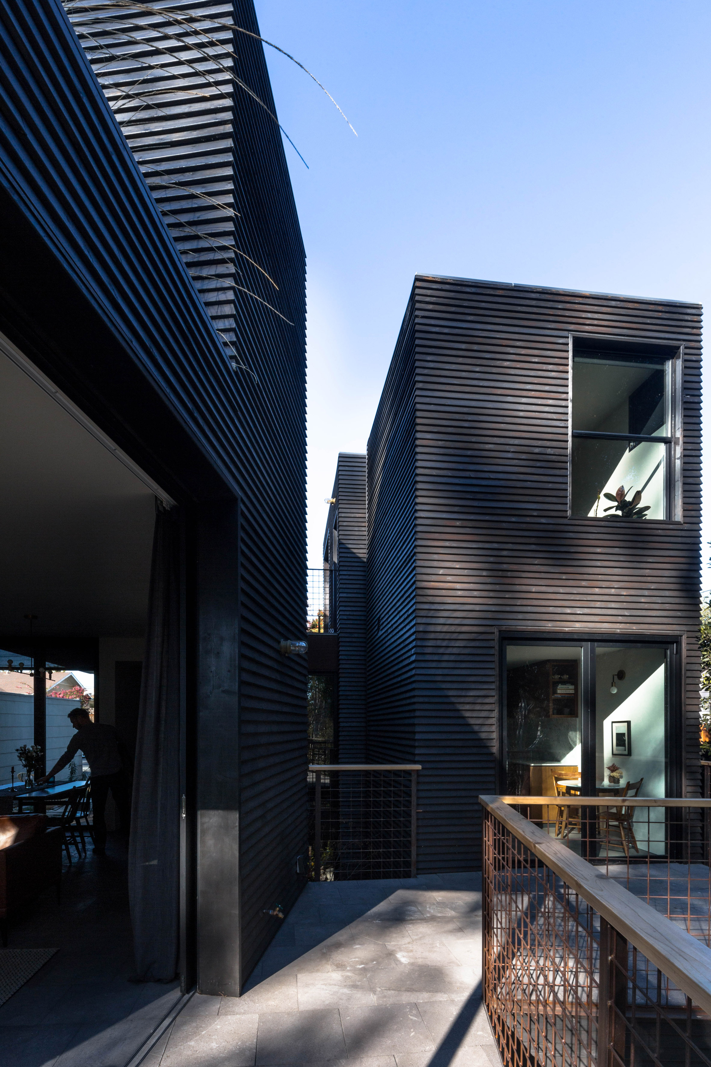
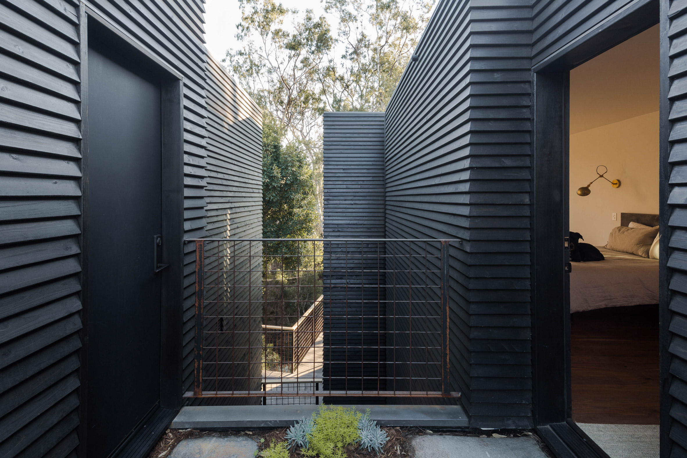
Spanning three floors and lined in blackened wood, Redwood House has a varied construction comprising cuboid volumes and outdoor corridors.
The house measures 2,000 square feet (186 square meters) and is located near a canyon that crosses San Diego.
"The canyon created an essence so that the house can work and integrate," said Svitak.
Photograph by Tomoko Matsubayashi.
The back of the house faces a wooded ravine, while its facade facing the street remains more private. The house is accessed by a floating steel bridge and a sliding door of cedar.
Photograph by Tomoko Matsubayashi.
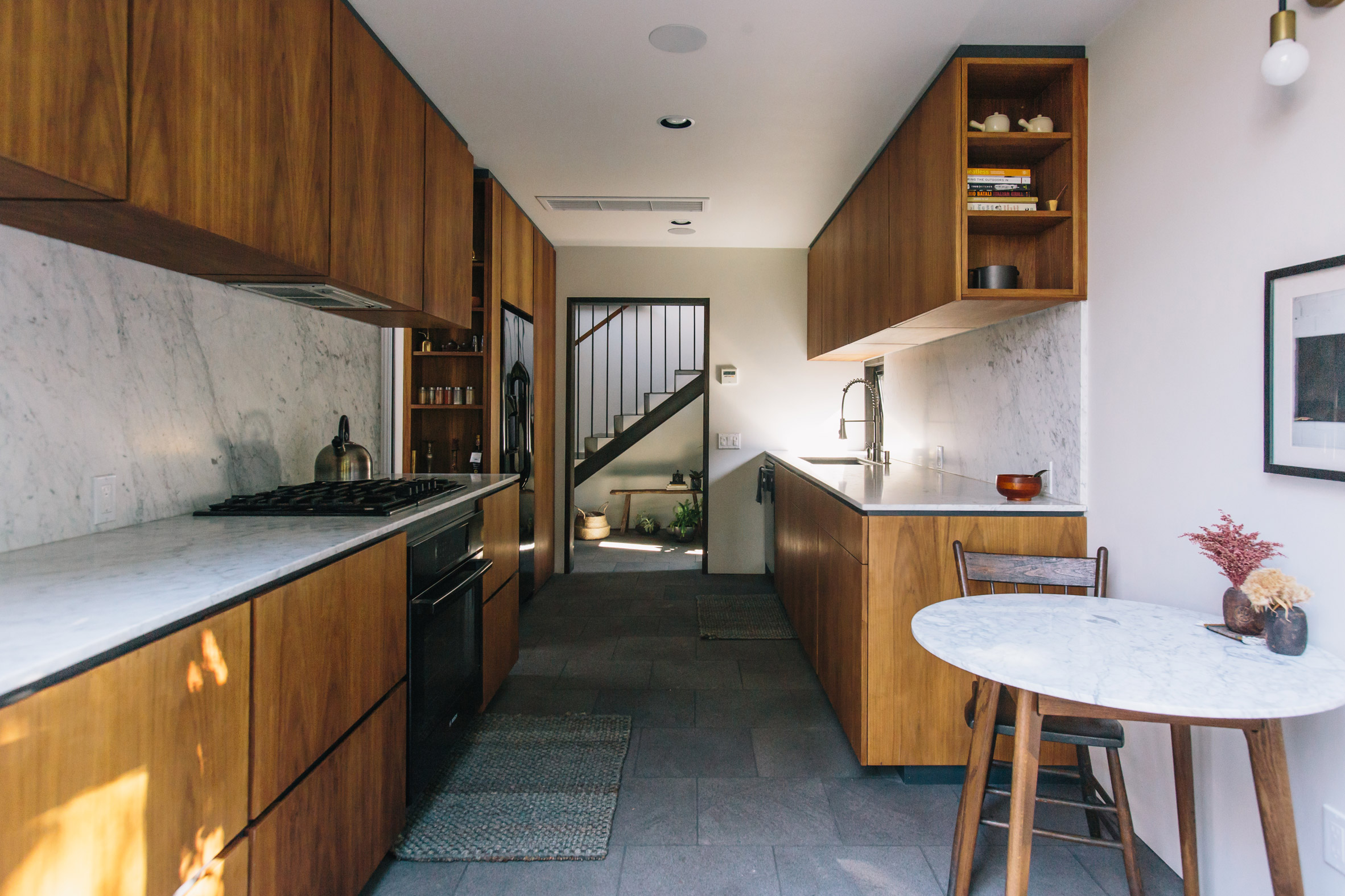
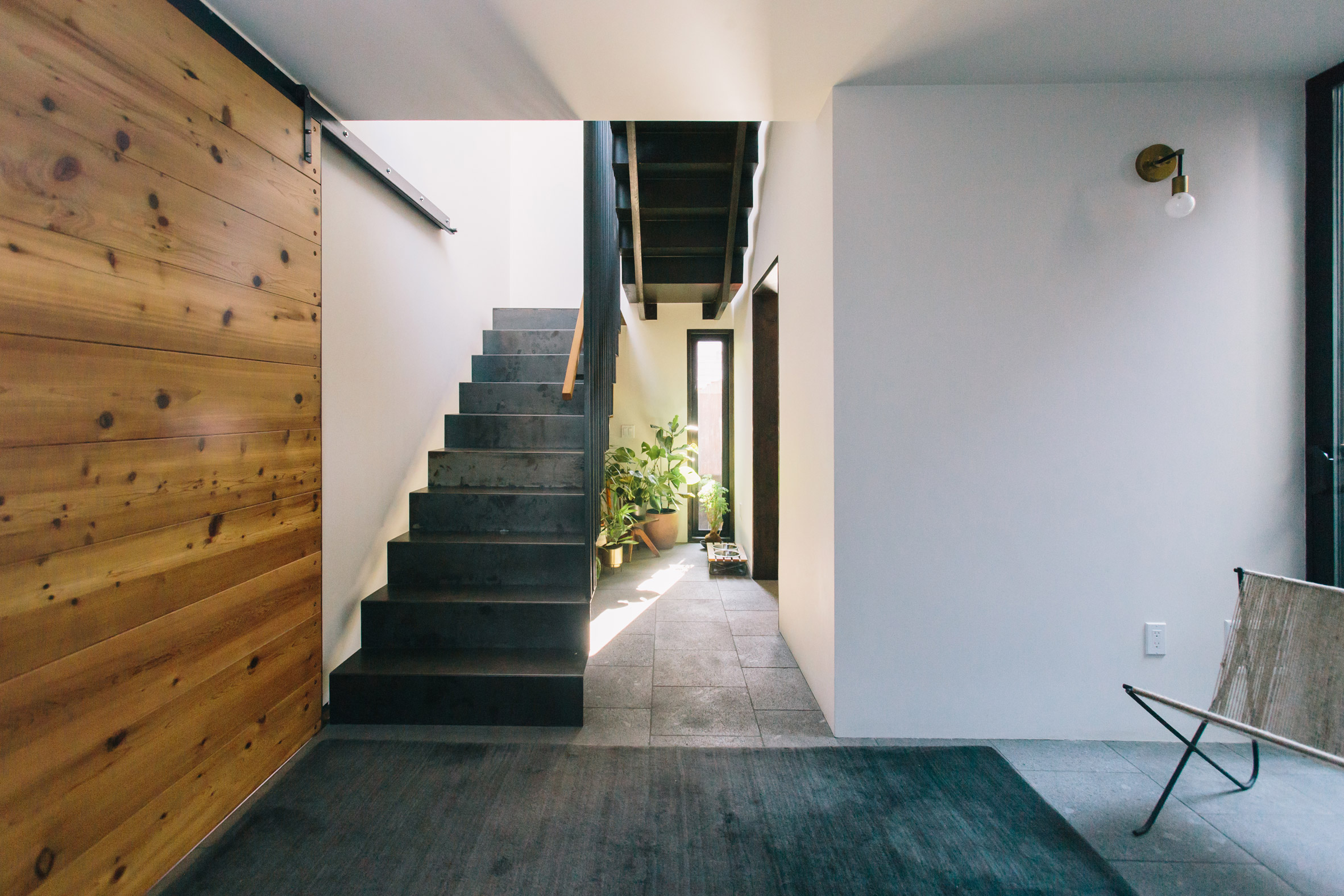
Upon entering there is a hall, a dressing table and a staircase. On the left there is a galley kitchen, and on the other there is a living and dining room.
Photograph by Tomoko Matsubayashi.
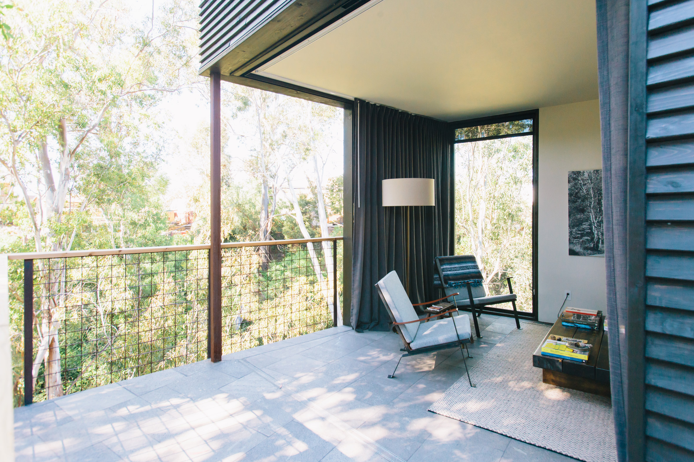
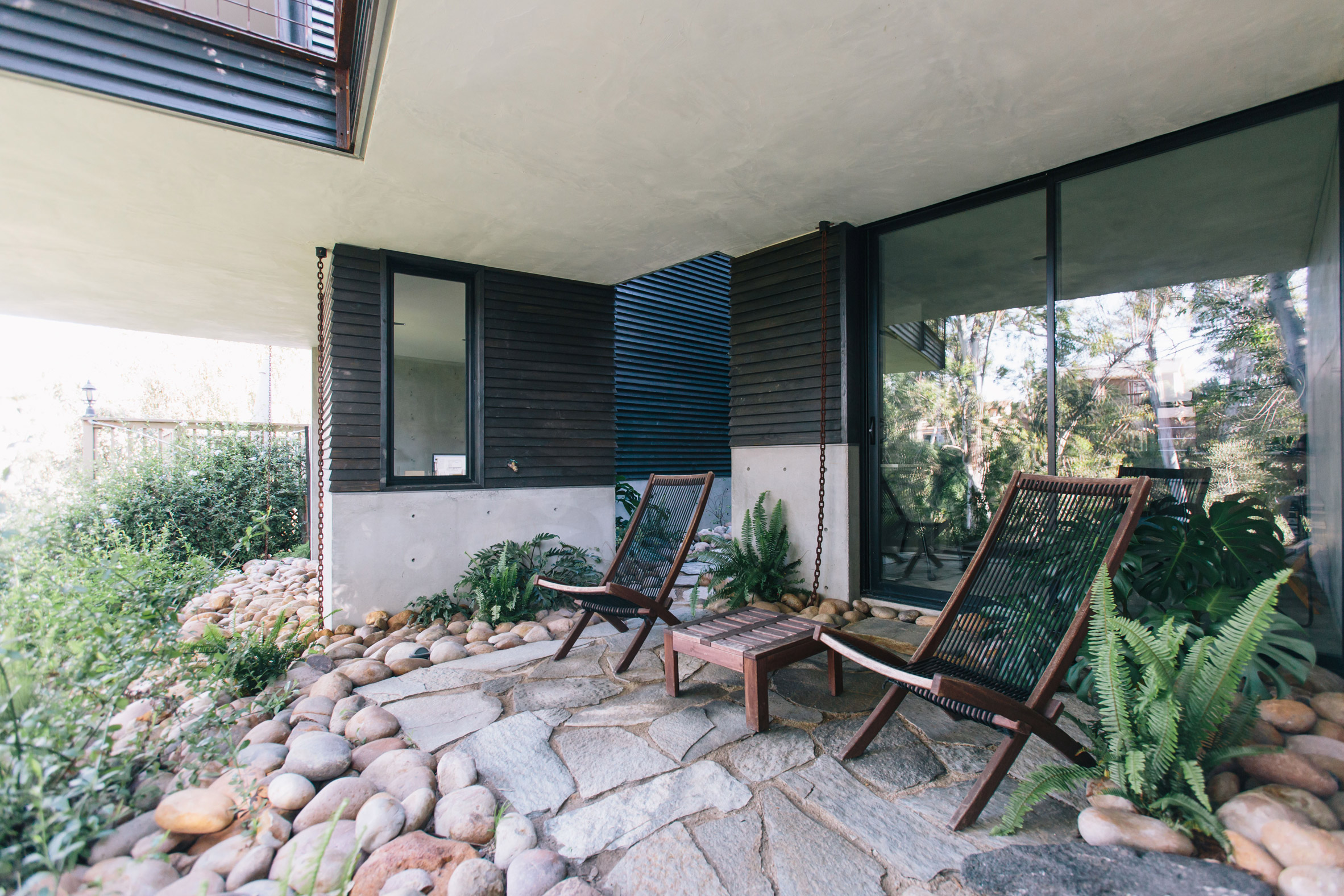
The living room is cantilevered with a glazed section lined with glass, which creates an indoor-outdoor room suitable for the warm climate of Southern California.
These two areas are separated by an internal courtyard, but joined by the front hall and a back deck, thus creating a circular route around the floor plan.
"Instead of a blunt mass object between the street and the canyon, the house is divided into separate mass elements, which allow the cannon to enter the spaces of the house and study through a thin patio element" said Svitak.
Photograph by Tomoko Matsubayashi.
Upstairs there are two bedrooms with bathrooms en suite. The second, larger room has an outdoor patio and overlooks a green roof.
Photograph by Tomoko Matsubayashi.
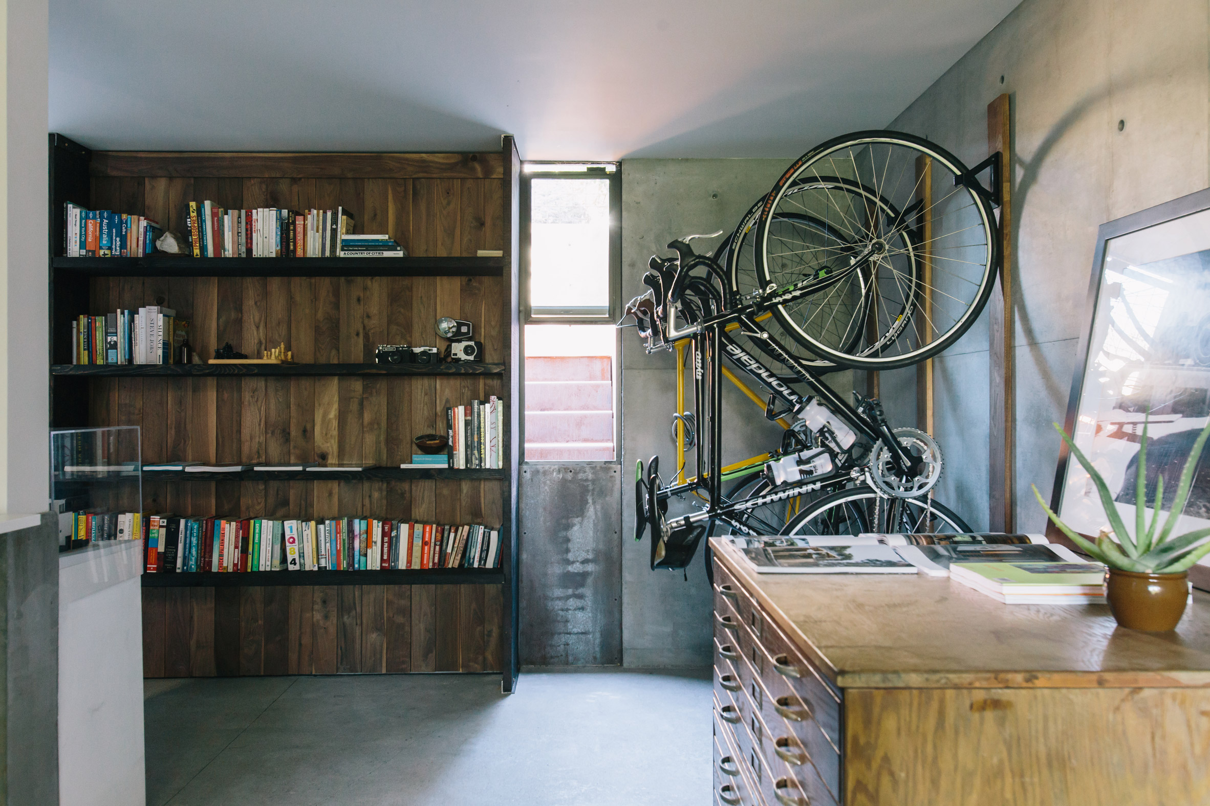
In the basement is the owner's architecture studio, which consists of a meeting room, work area, bathroom, private rear terrace and entrance patio.
Photograph by Tomoko Matsubayashi.
"The architectural footprint, while small, is vertically integrated to offer a wide range of life opportunities through complex but refined geometry and spatial designs," said Svitak.
Architects often design houses and studios combined on their own. Others who have recently completed this type of project include Moss in Chicago and Another Studio in Bulgaria.
The photograph is by Onnis Luque unless otherwise indicated.
Simon Astridge adds a white brick extension to the restored Victorian house
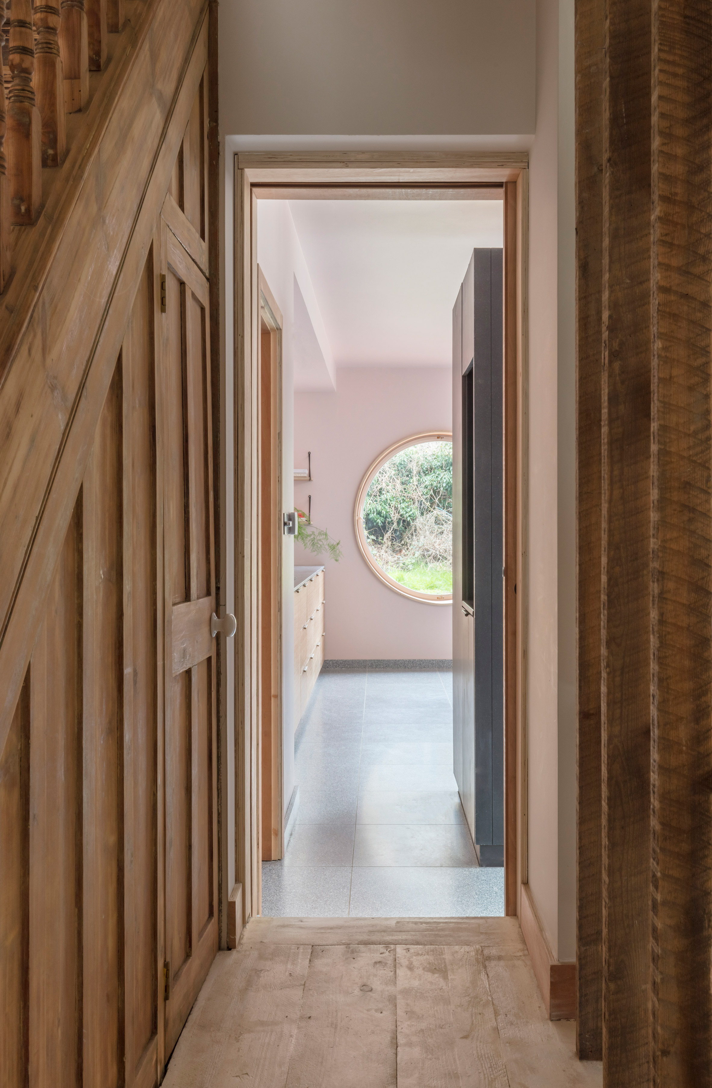
A large window in the shape of a porthole punctures the white brick façade of this extension of a townhouse in north London, designed by Simon Astridge.
Astridge, based in London, was commissioned to renovate and expand the property near Highbury Fields, to create a sequence of more contemporary spaces for a scientist and his family.
He set out to remodel the townhouse by gutting its interior to reveal some of the details and original finishes.
"The house was returned to its original state to unravel its original features and analyze the structure of the building," Astridge explained.
"The most modest building materials are intertwined with the existing fabric, joining the original features with simple interventions."
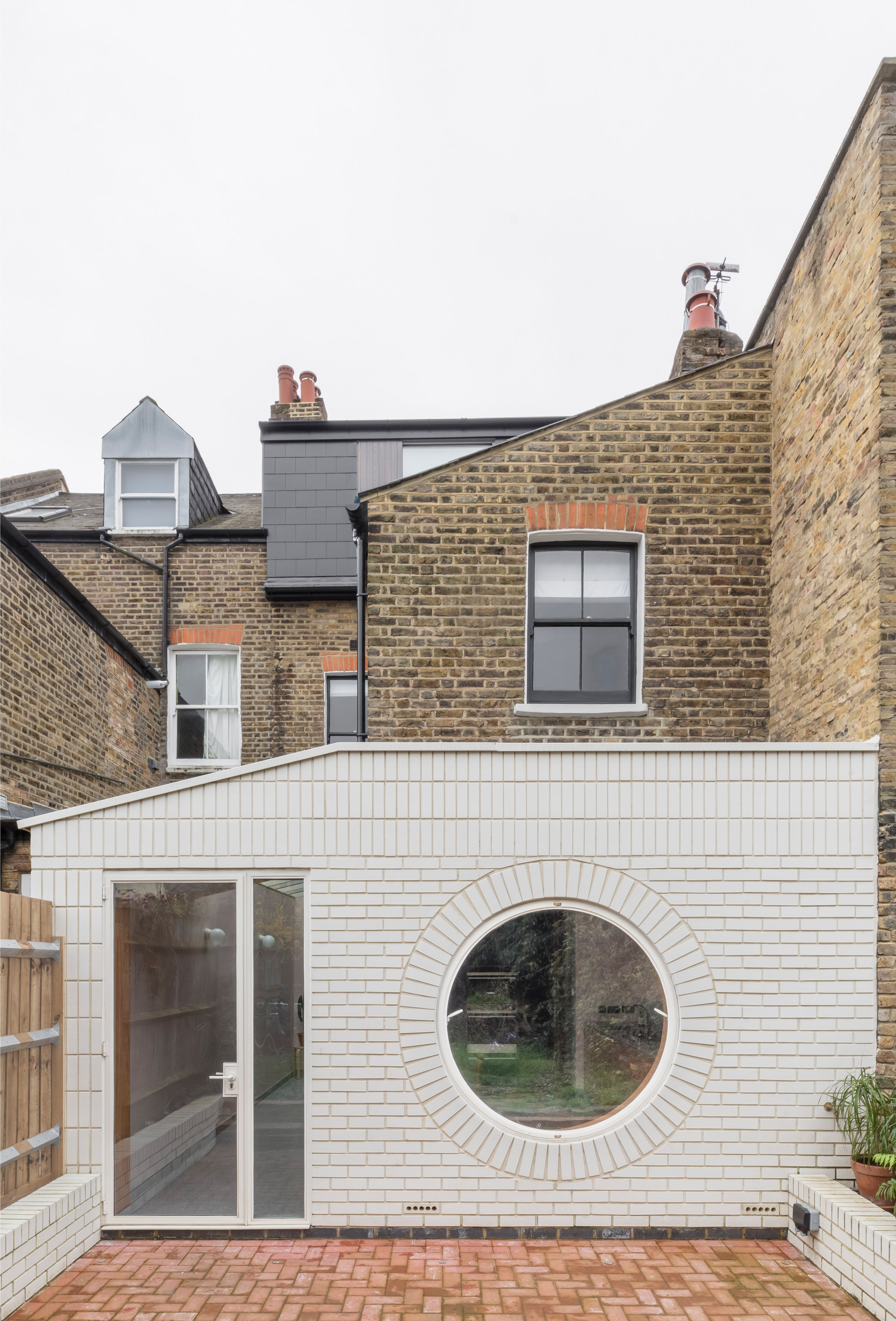
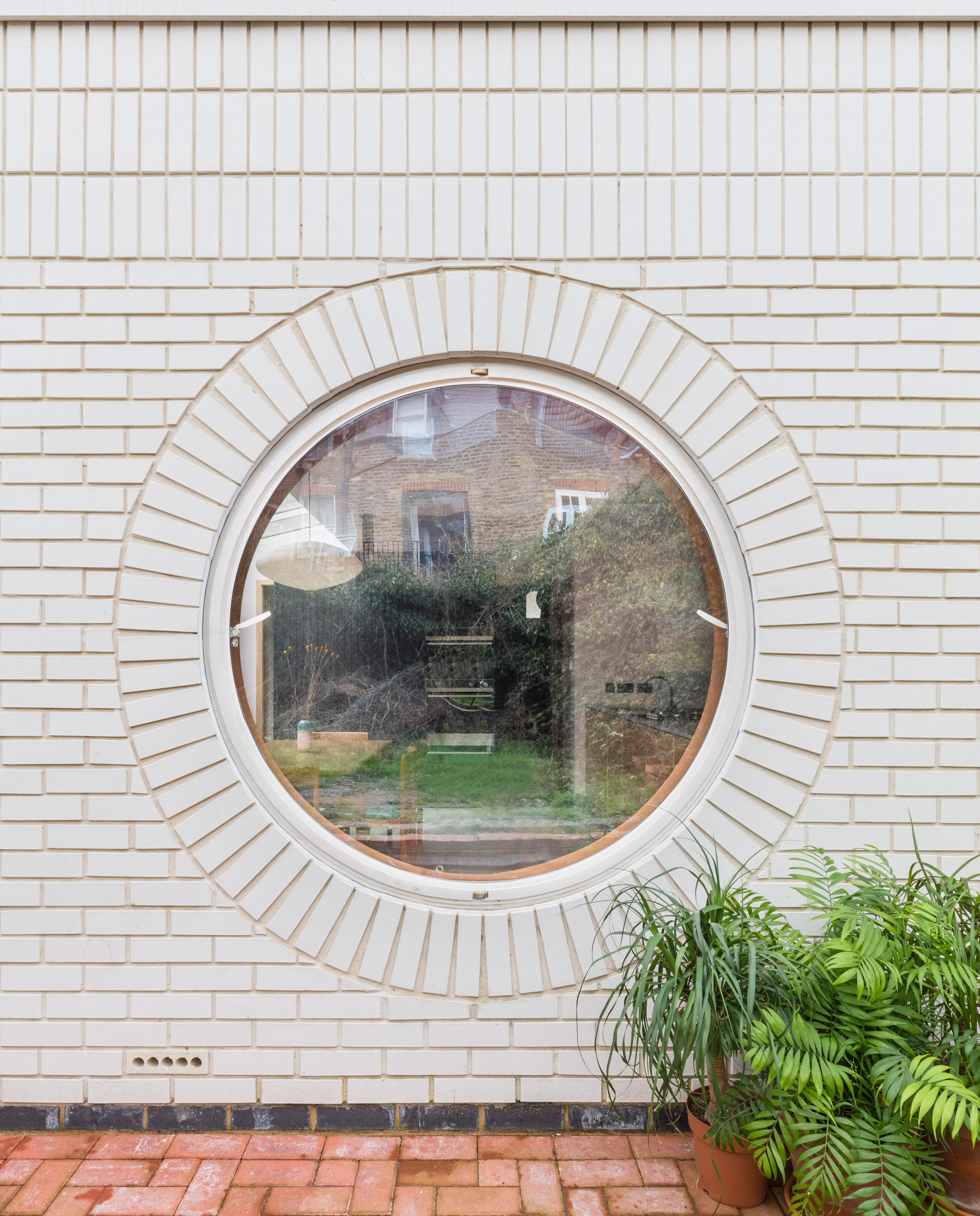
The new extension on the back of the property contains a kitchen. The volume of a single floor is externally clad in a white brick that contrasts with the original brick of the facade of London.
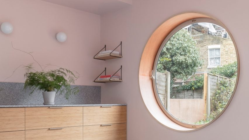
The ceiling light, the glass door and the circular window allow daylight to enter the space while addressing the problem of the view of neighboring buildings.
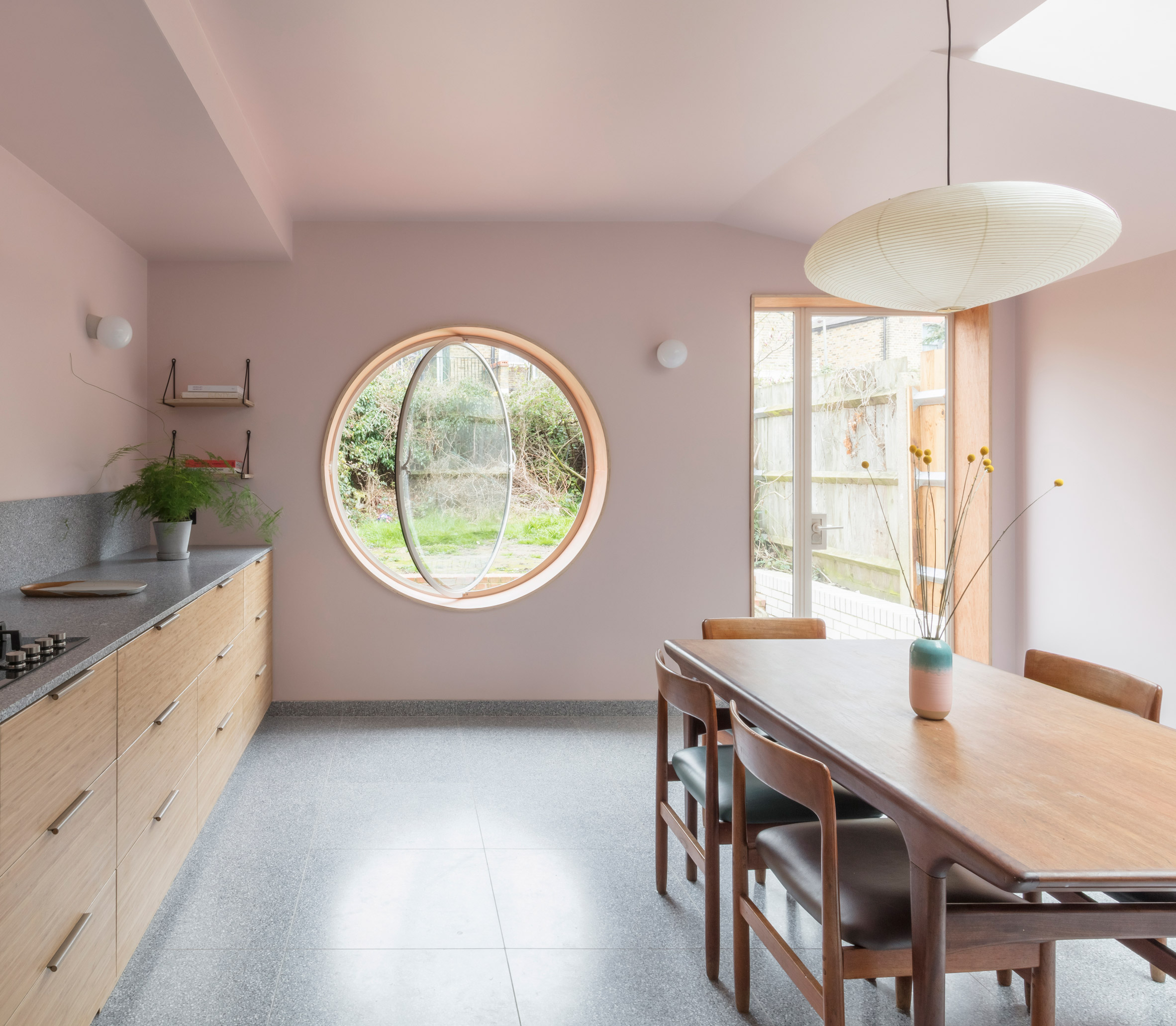
The window frames a view towards the blackberry bushes at the end of the garden and rotates on its vertical axis to create a window seat connected to the interior and exterior spaces.
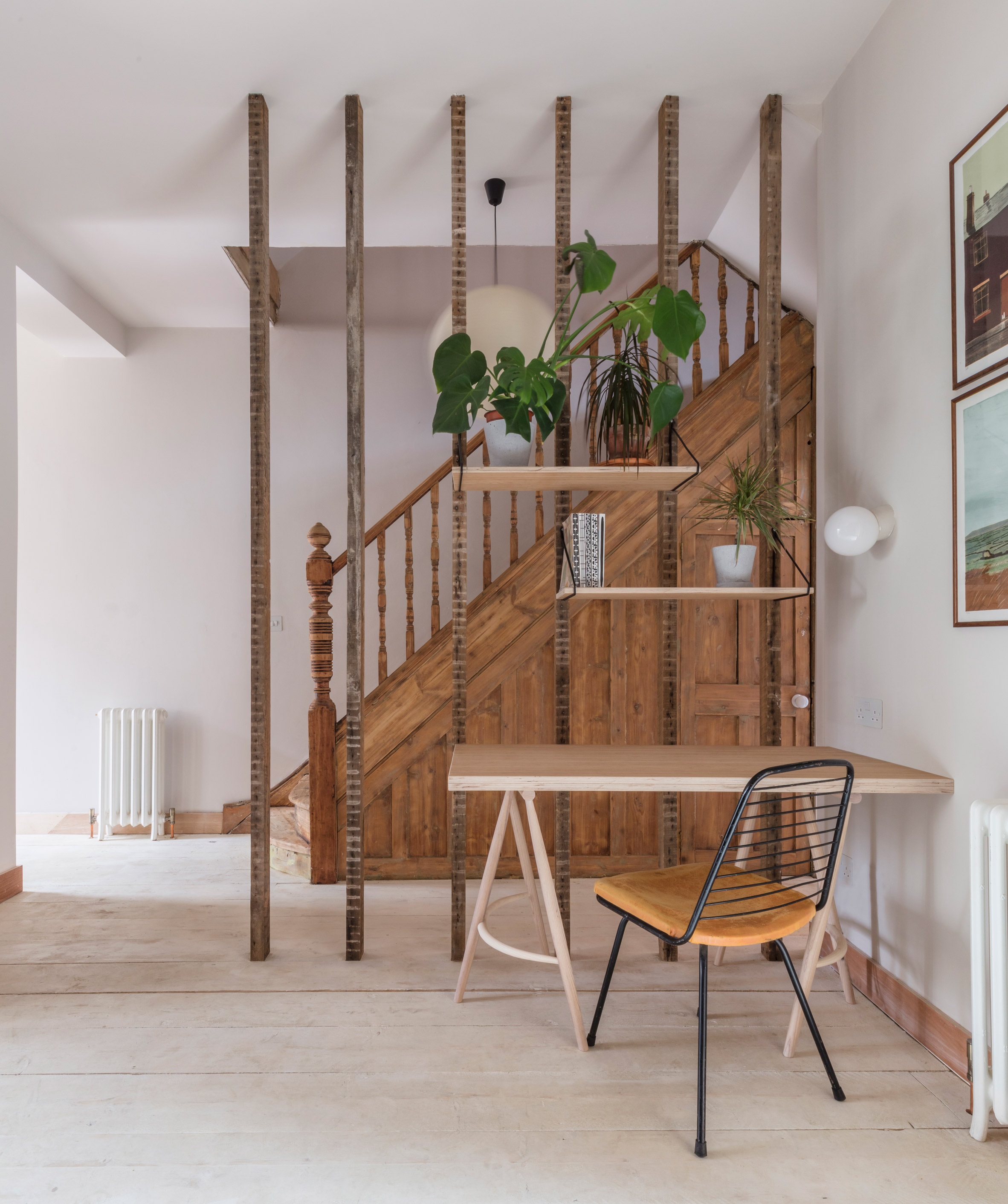
The architects chose to retain the elements, such as the Victorian staircases, the brickwork and the wooden beams, which remain in their exposed state.
This decision helped reduce costs, in addition to creating a connection to the building's past and providing textural interest in several of the rooms.
The corridor at the entrance of the house opens into a living space with high ceilings that is flooded with light now that a partition separating it from a previous corridor has been removed to reveal the naked poles.
A restored staircase that leads from this space to another two floors is finished off with a new skylight that allows natural light to illuminate the upper part of the staircase.
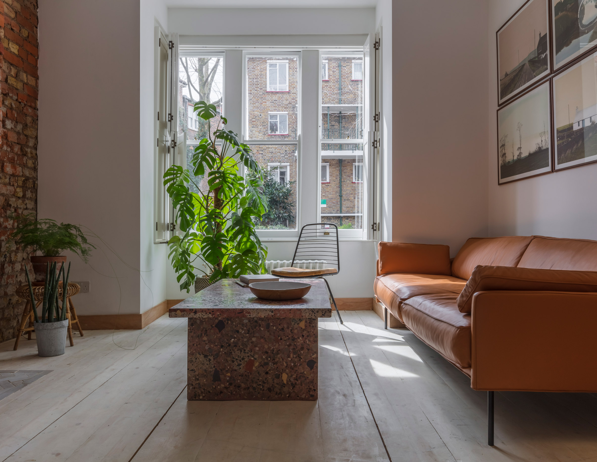
One of the walls that line the staircase shows the original brick of the house, which also becomes a feature of the living room on the ground floor and on the final wall of the master bedroom.
Naturally aged surfaces are juxtaposed with contemporary materials such as terrazzo, black engineered woodwork, walls painted in pastel colors and red plywood doors.
A gray terrazzo is applied to all surfaces of floors, skirts and countertops in the kitchen, while a table in the living room is made of slabs of material with a reddish hue.
The material that gives the project its title, Terrazzo House, was chosen because "it reminded the owner to look through the microscope".
The photograph is by Nicholas Worley.
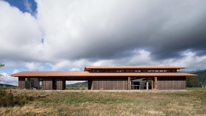
Olson Kundig's Trout Lake Residence opens to the Washington landscape
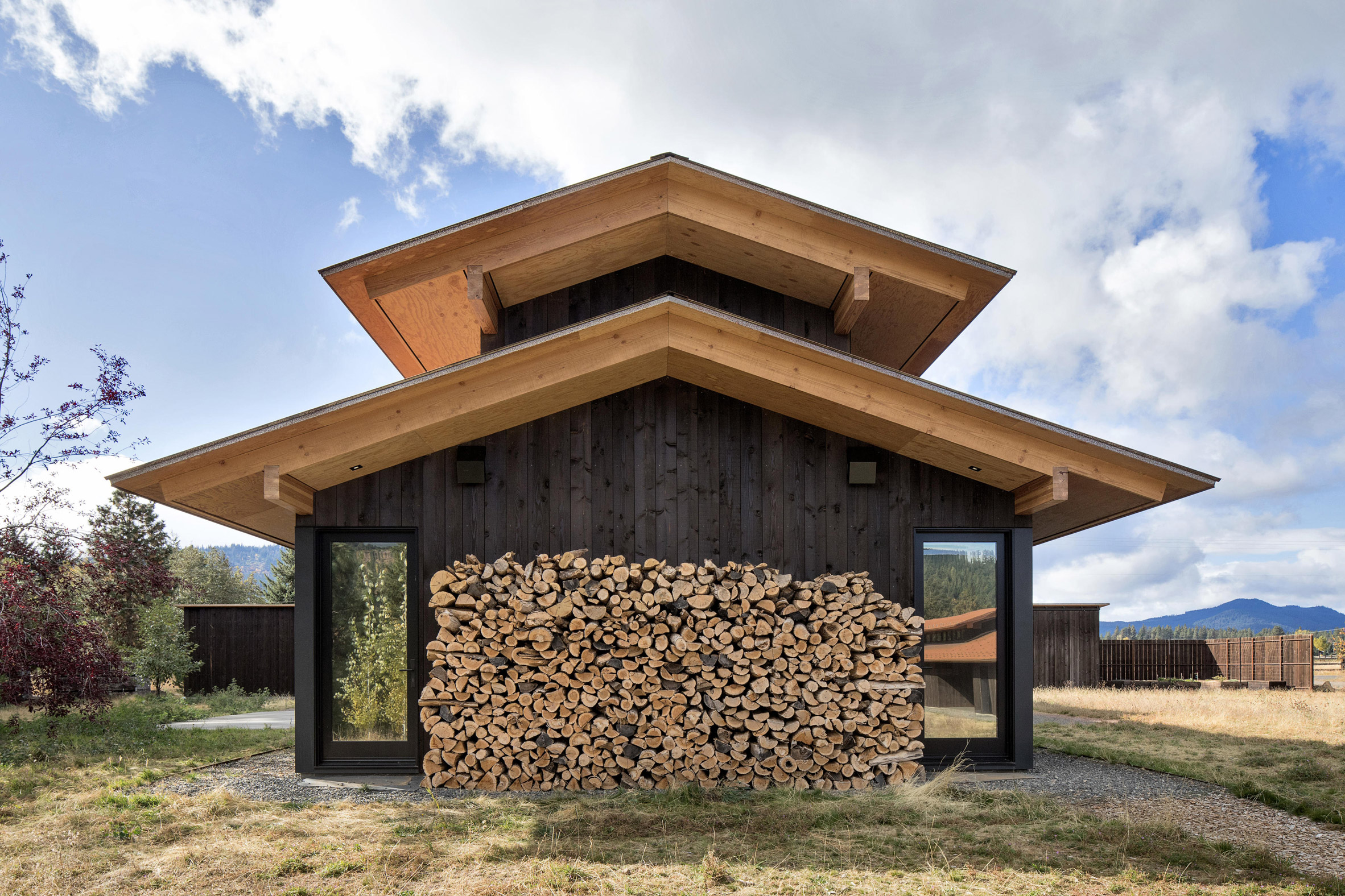
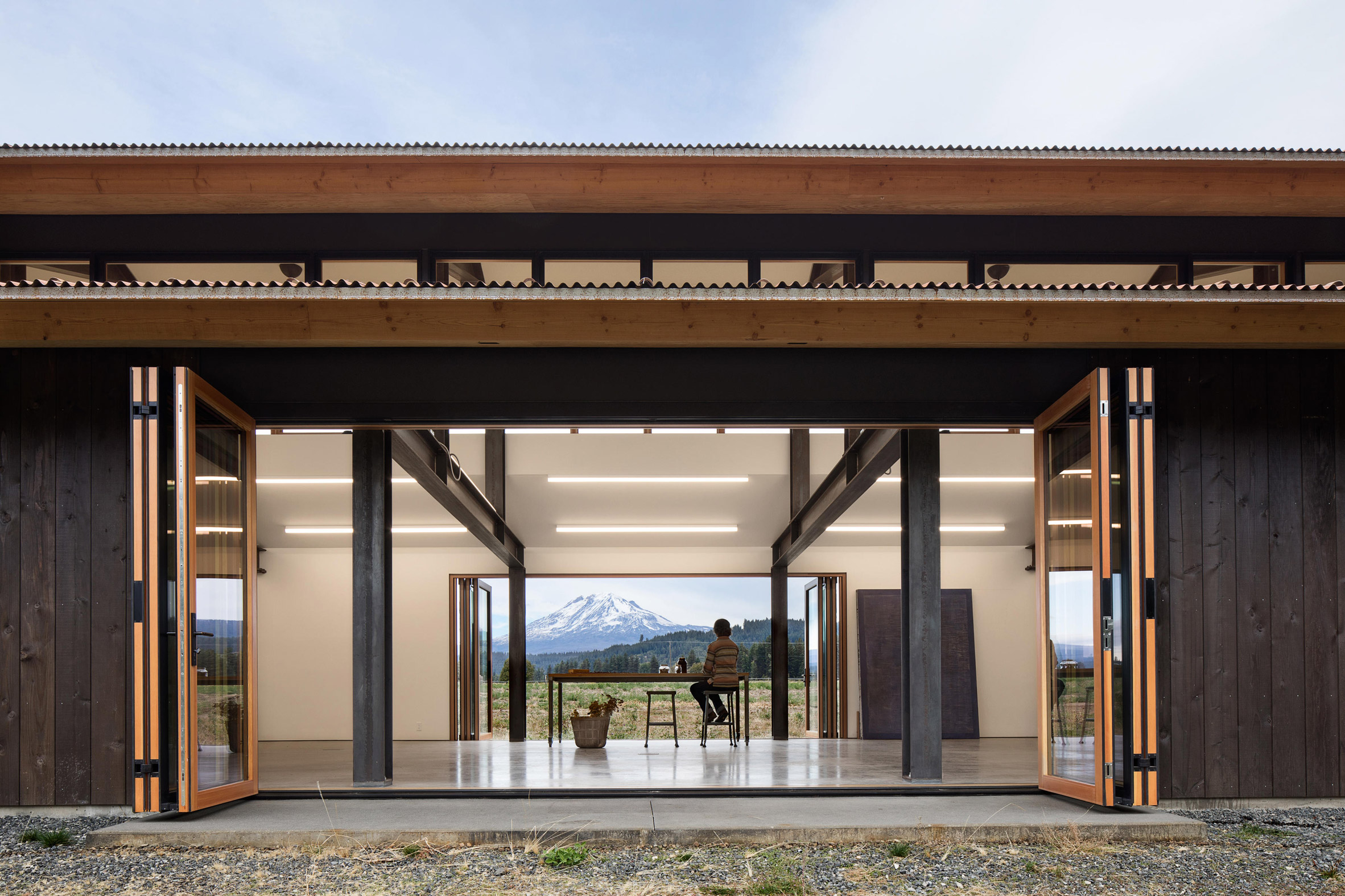
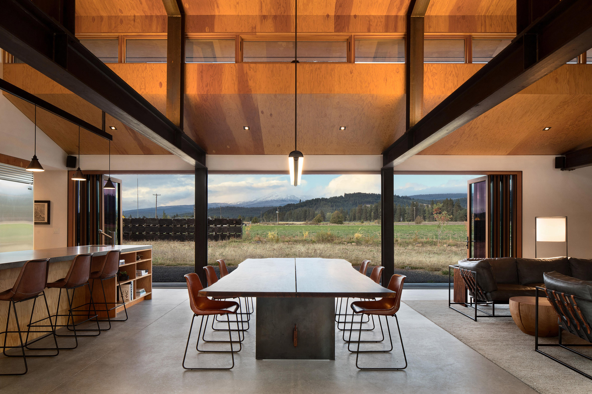
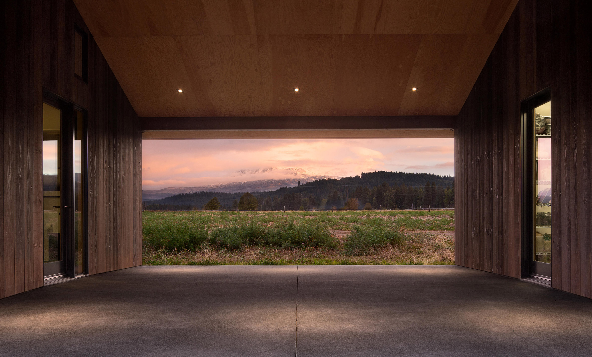
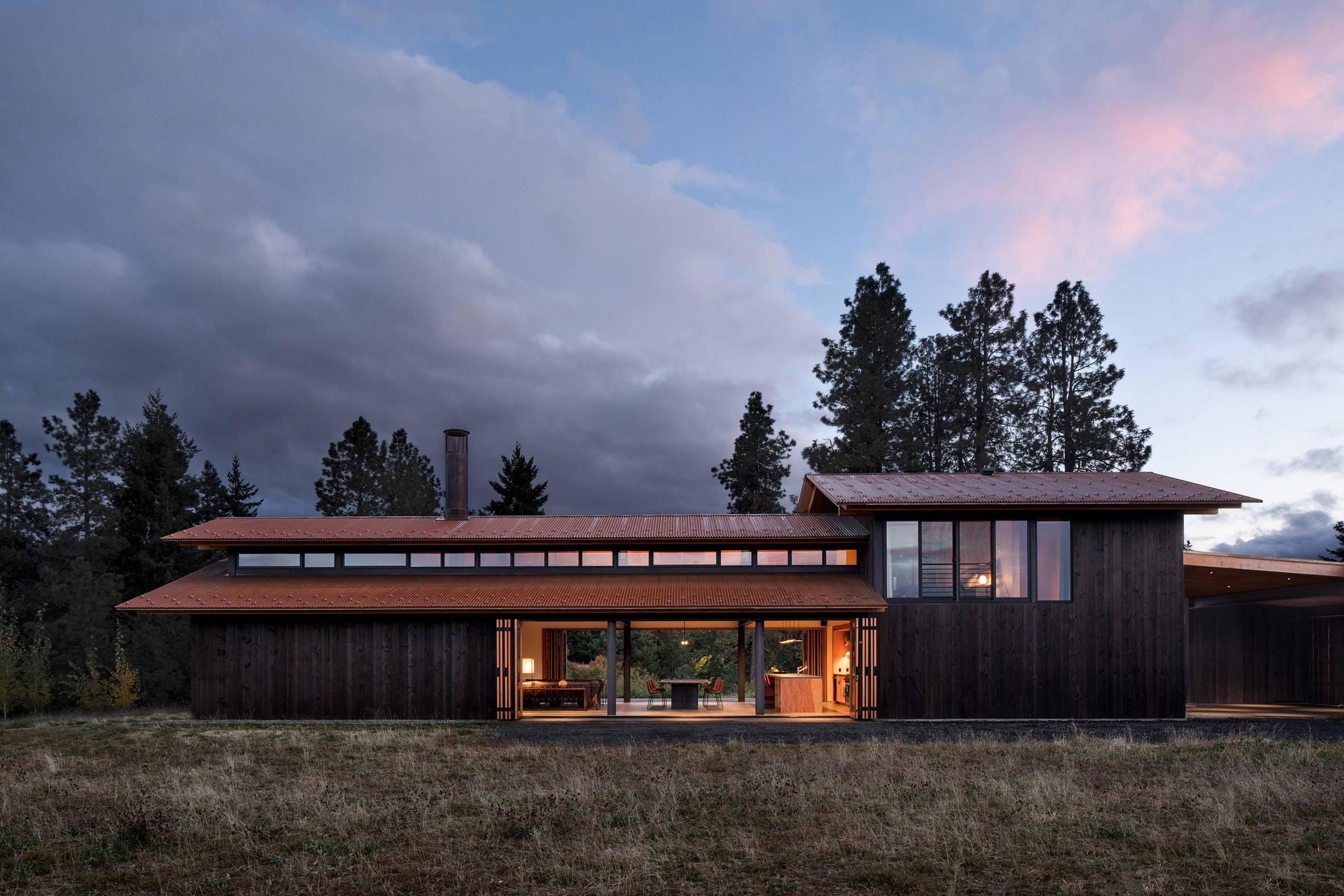
The huge bi-folding doors allow the retirement of this artist in Washington by the architectural firm Olson Kundig open to the outdoors and accommodate large works of art.
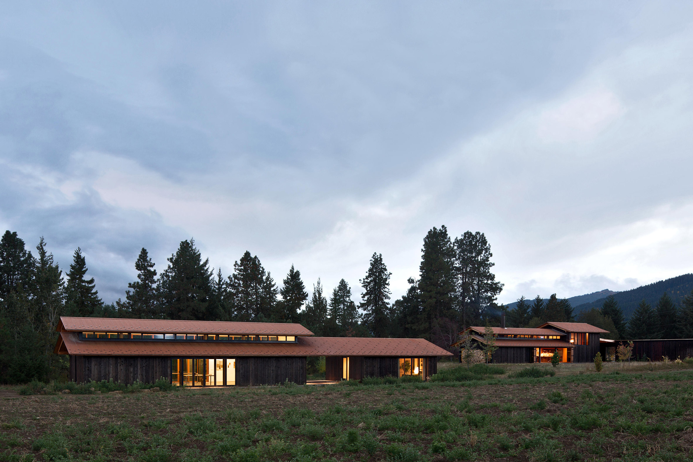
Located in the rural area of Trout Lake, the complex consists of four buildings arranged in two groups. The clients, a couple of artists, wanted study spaces that would be separated from their rooms.
"Both owners are artists who incorporate the natural landscape in their work," said a statement from Olson Kundig, based in Seattle. "He is a painter and photographer, and she is a textile artist and designer."
The first group is a T-shaped structure that includes the main residence, work spaces and a garage under the same roof. A covered patio connects the intersection of the three volumes.
A path leads to the secondary building, which contains another large art studio and guest rooms. "Here, the owners work on their own projects, and occasionally organize retreats and art workshops based on the community," said Olson Kundig.
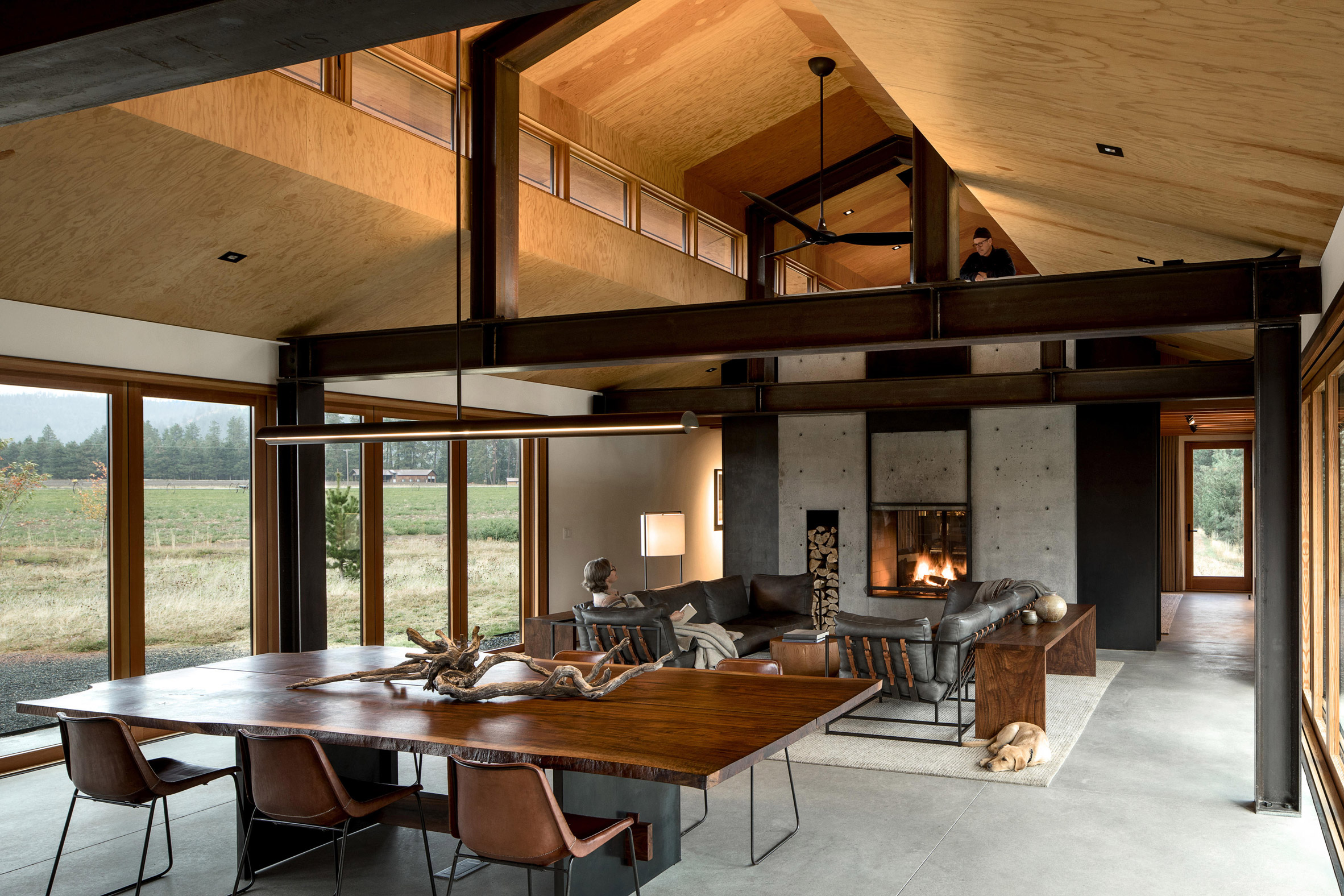
The main residence has a single bedroom on the upper level, while the lower floor is for living spaces. The sleeping area is accessible via a staircase in the entrance hall.
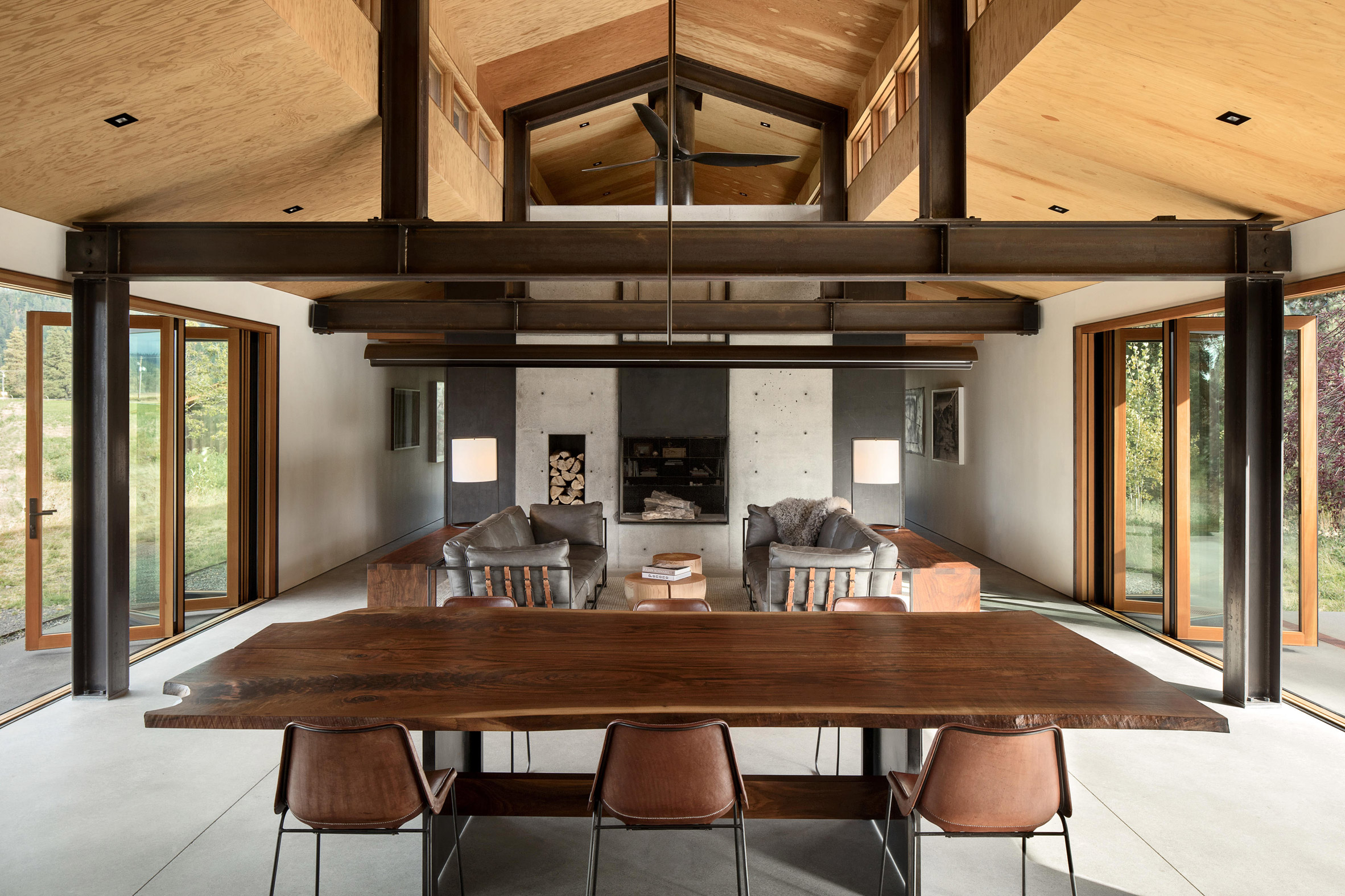
On the ground floor, a double-sided fireplace separates a library from the open kitchen, living and dining room. Here, large folding doors open onto the landscape.
"In the four buildings, large folding doors and sliding barn doors open spaces completely to the outside, allowing the movement of great works of art and equipment, as well as an intimate connection with the environment," said the architects.
In addition to these openings, a series of clerestorios runs along the longitudinal volume, bringing more light to the space.
Similar to the main house, the guest annex draws signs of vernacular architecture. "The buildings are reminiscent of the agricultural forms of the local built environment, but as it is our nature in our designs, we try to take that context and evolve it into a more emphatic modern language," said Tom Kundig, one of the firm's directors.
The architects tried to use simple materials with easy maintenance. The interior finishes include polished concrete and plywood, and the steel structure of the building was exposed.
On the outside, the dark wood cladding covers the sides of the building, while corrugated metal is used for roofing. The owners participated in the construction process by wearing down these materials.
Kundig founded his firm with his partner Jim Olson in 1967, and the firm has developed extensively in the western United States.
Other projects include a house in Idaho with several automated features and an expansion to a small cabin that Jim Olson built in 1959 as an architecture student.
The photograph is by Jeremy Bittermann.
The Dutch Pavilion invites you to explore a wardrobe similar to Narnia
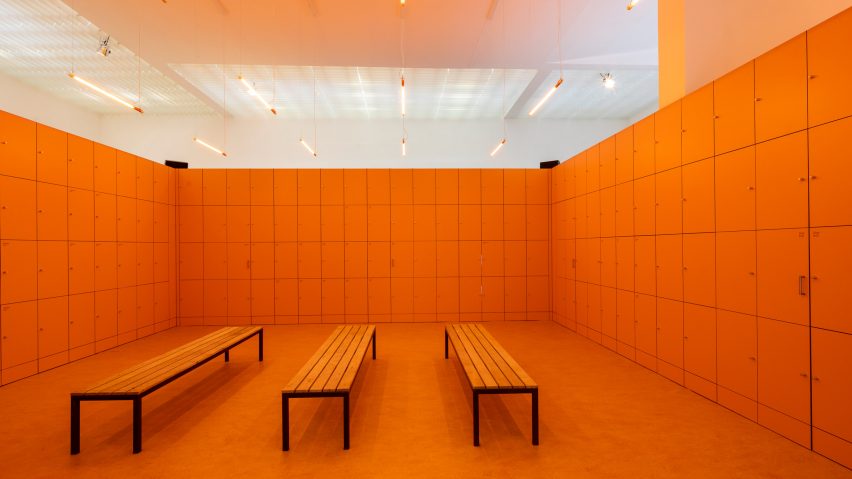
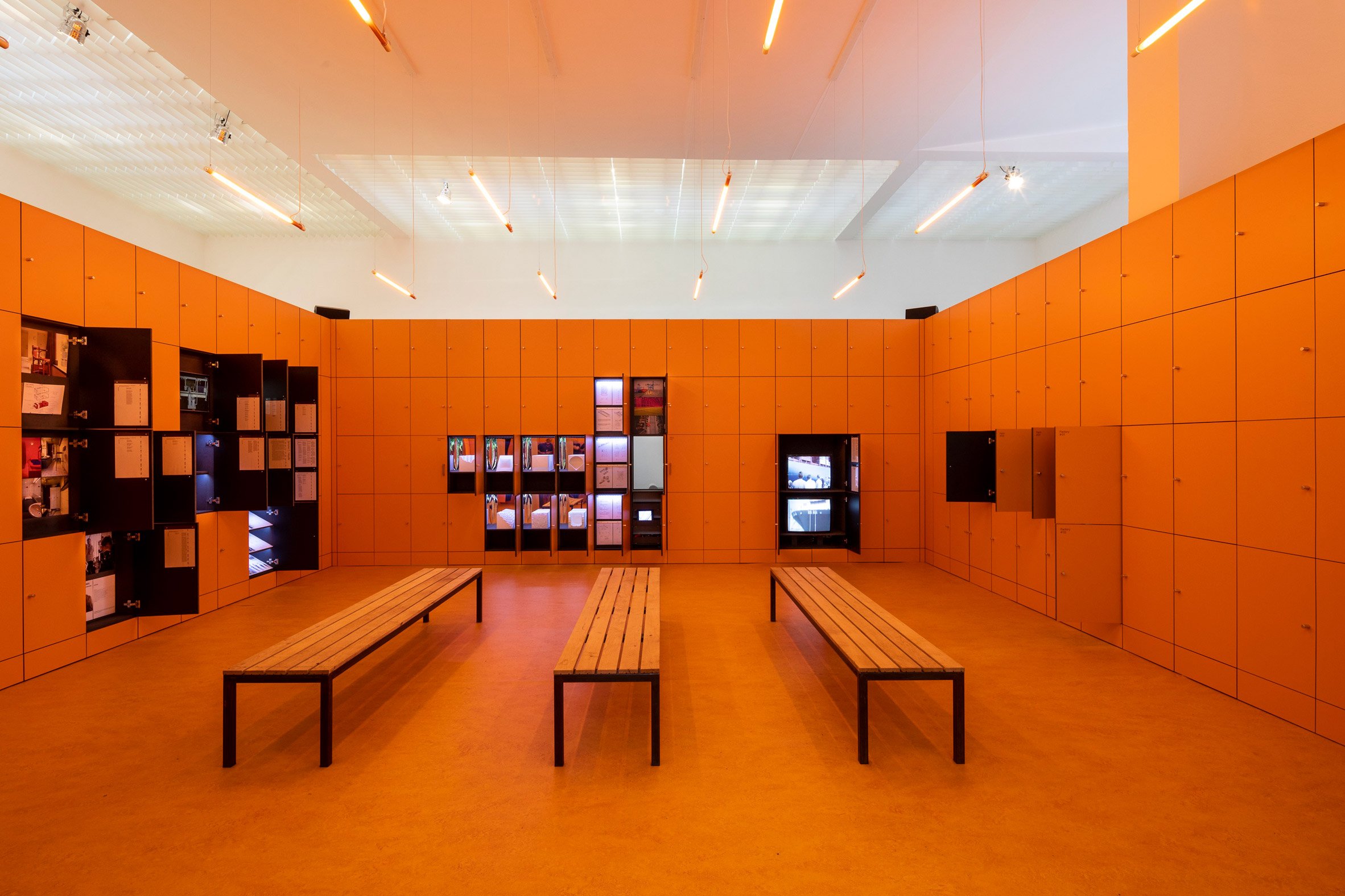
The orange lockers open to reveal secret rooms, windows, videos and images inside the Pavilion of the Venice Biennial of the Netherlands, in an exhibition that explores the future of physical work.
Called Work, Body, Leisure, the exhibition in the Dutch Pavilion seems to comprise a single room lined on all sides by lockers.
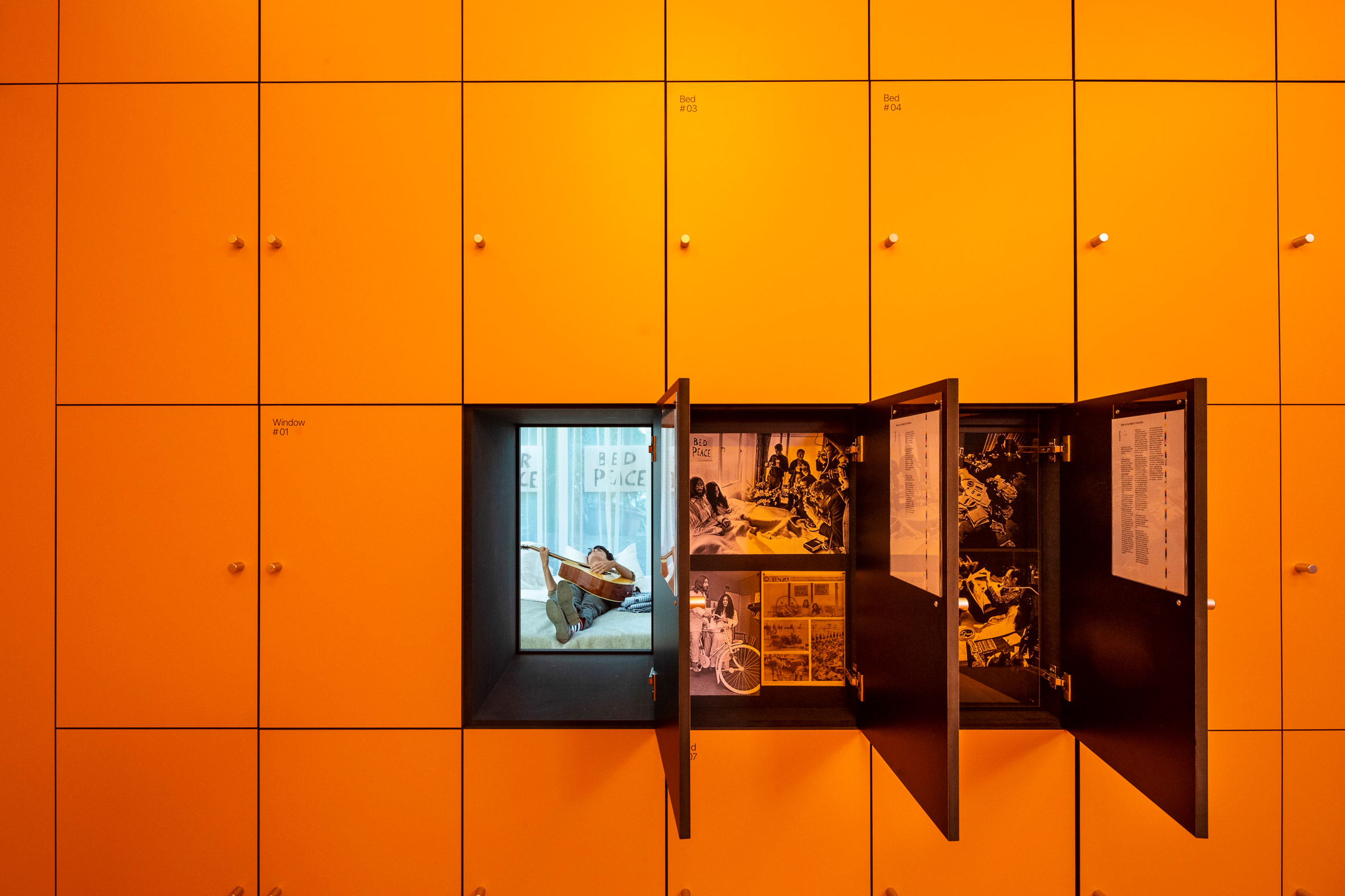
But as visitors open the doors, they discover a variety of projects presented in different media, from simple photographs to installations that fill complete rooms.
The projects were selected by curator Marina Otero Verzier, director of research at Het Nieuwe Instituut, to show how humanity will be transformed into a time when robots can take on many jobs traditionally carried out by humans.
"We are fascinated by these transformations of manpower in the future, and also by the transformations of the architecture and the bodies that live in that architecture," explained Otero Verzier, who also appears in Dezeen's new documentary on drones, Elevation.
"The pavilion traces a journey through these different spaces: on the one hand, they seem familiar and even banal, however, we believe they are the central spaces to consider when we think about the future of work and what our cities could be" , He said. Dezeen
Otero Verzier chose to create a wardrobe, since these spaces, which are found in most factories, offices and gyms, are places where the bodies of people are changed, ready for physical activity.
They are orange, since this is the tone that is often used to symbolize the Netherlands.
"The closet is the interface between this moment and these other different architectures," said Otero Verzier. "It is a space that is completely organized and compartmentalized, you have an egalitarian society, but in a certain sense it is very limited."
The projects contained within the lockers cover a wide range of architectural typologies, which include offices, playgrounds, farms and factories, windows, beds, doors and virtual spaces. Some open in groups, creating enough space for the doors that lead to the hidden rooms beyond.
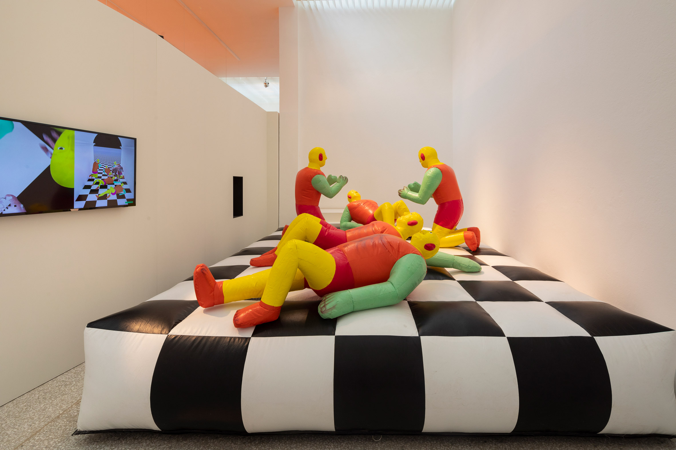
In one of these hidden spaces, the inflatable humanoid shapes of the primary colors jump on an inflatable wooden board platform. The installation, by Simone C Niquille, analyzes how digital avatars are used to measure the safety of workers.
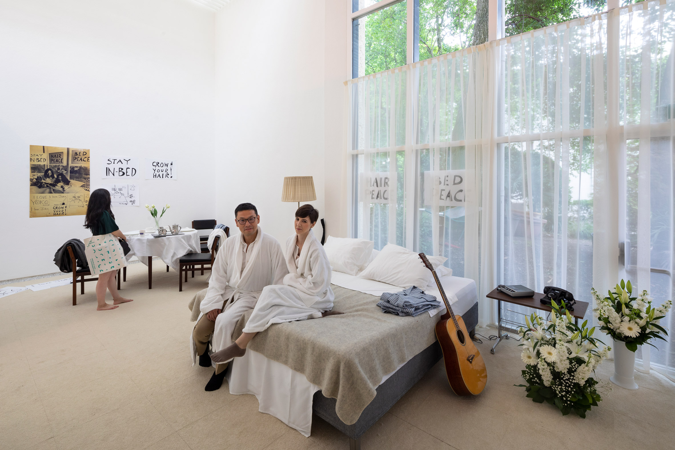
On the other hand, the Princeton University professor, Beatriz Colomina, created an installation called Bed-In, which recreates the "landmark" of John Lennon and the bed of Yoko Ono in room 902 of the Amsterdam Hilton Hotel. His goal was to show how the bed is now a place of work and sleep.
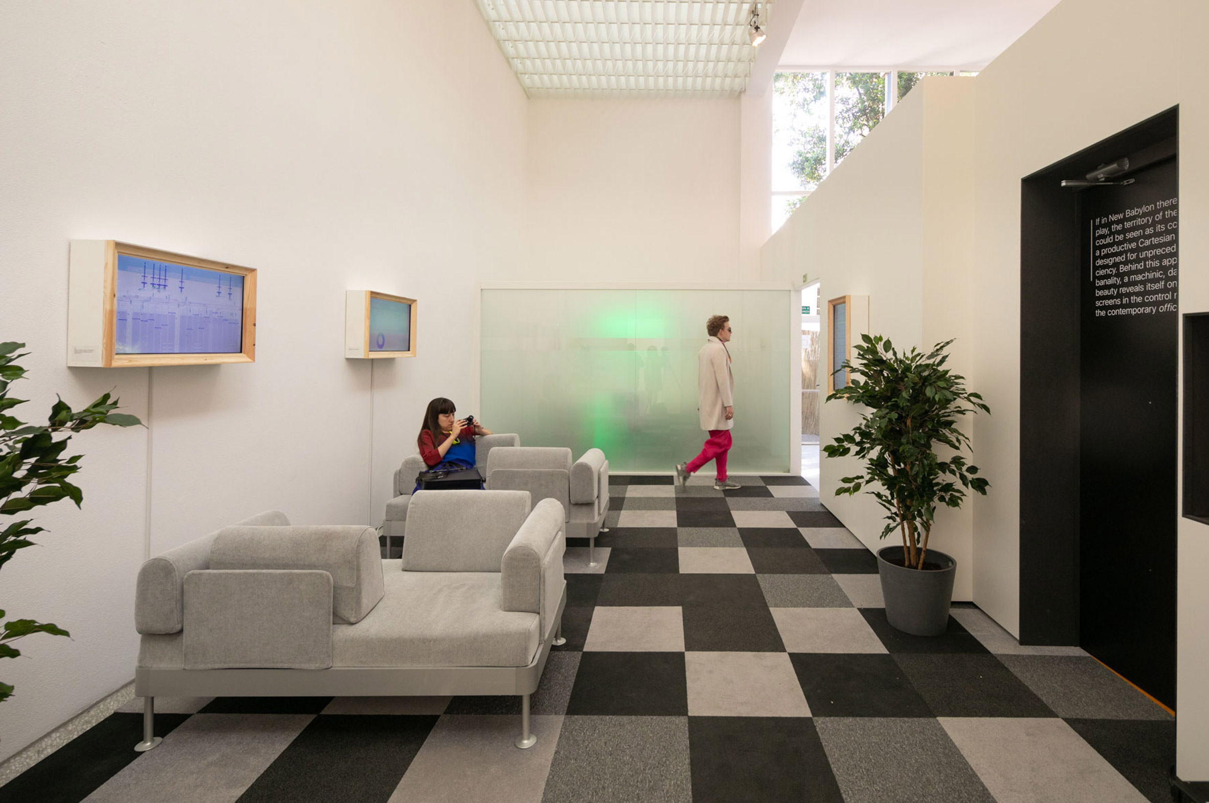
In another project, the dean of architecture at Columbia University Mark Wigley revisits New Babylon, a work of art by Constant Nieuwenhuys, to reflect on the violence of robotic work.
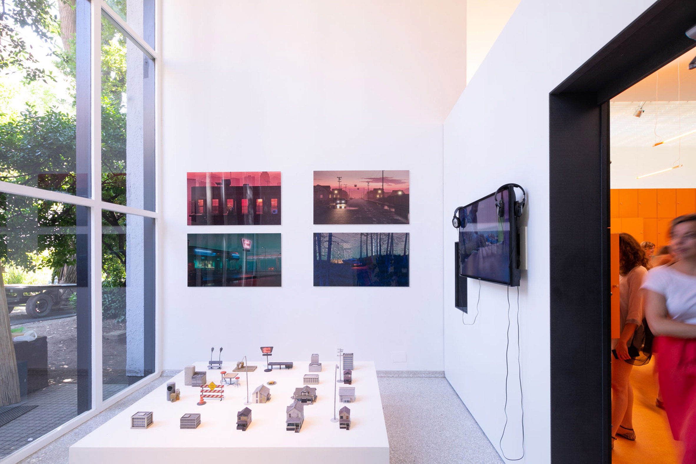
There is also a room full of models, organized by Liam Young, which analyzes how factory workers in India are sometimes behind the visions of future architecture launched by Western architecture studios.
According to Otero Verzier, it is particularly important that architecture commits itself to these problems at a "moment when architecture is being automated".
"What interests me is that most of the spaces we are analyzing," he said. "Most architects are not present in the design, so somehow it seems that technology is faster than architecture."
"So, if we want to remain a relevant profession in the transformation of cities and be an active agent in making those decisions, we must begin to be part of the conversations."
Also in this year's biennial, the Nordic Pavilion has been filled with inflatable bubbles that inflate and deflate in response to fluctuations in their environment, to symbolize how humans can create an architecture in symbiosis with the environment.
The Golden Lion to the best pavilion went to the Swiss Pavilion, which offers visitors an experience in the style of Alice in Wonderland, while venturing through a replica of a floor full of accessories and giant and small accessories.
Photograph by Daria Scagliola.
Subscribe to:
Posts (Atom)
